




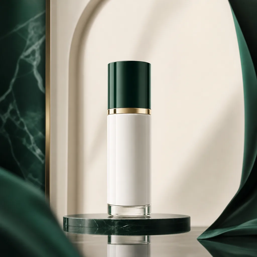
ケース 1
GPT Image 2 が向いている用途
GPT Image 2 による生成前後の変化を比較します。
GPT Image 2 は、品質調整とデザイン性を重視する AI 画像生成ページです。ブランド施策、商品表現、ポスター、レイアウト、文字を含むビジュアル、完成度の高い商用画像に向いています。
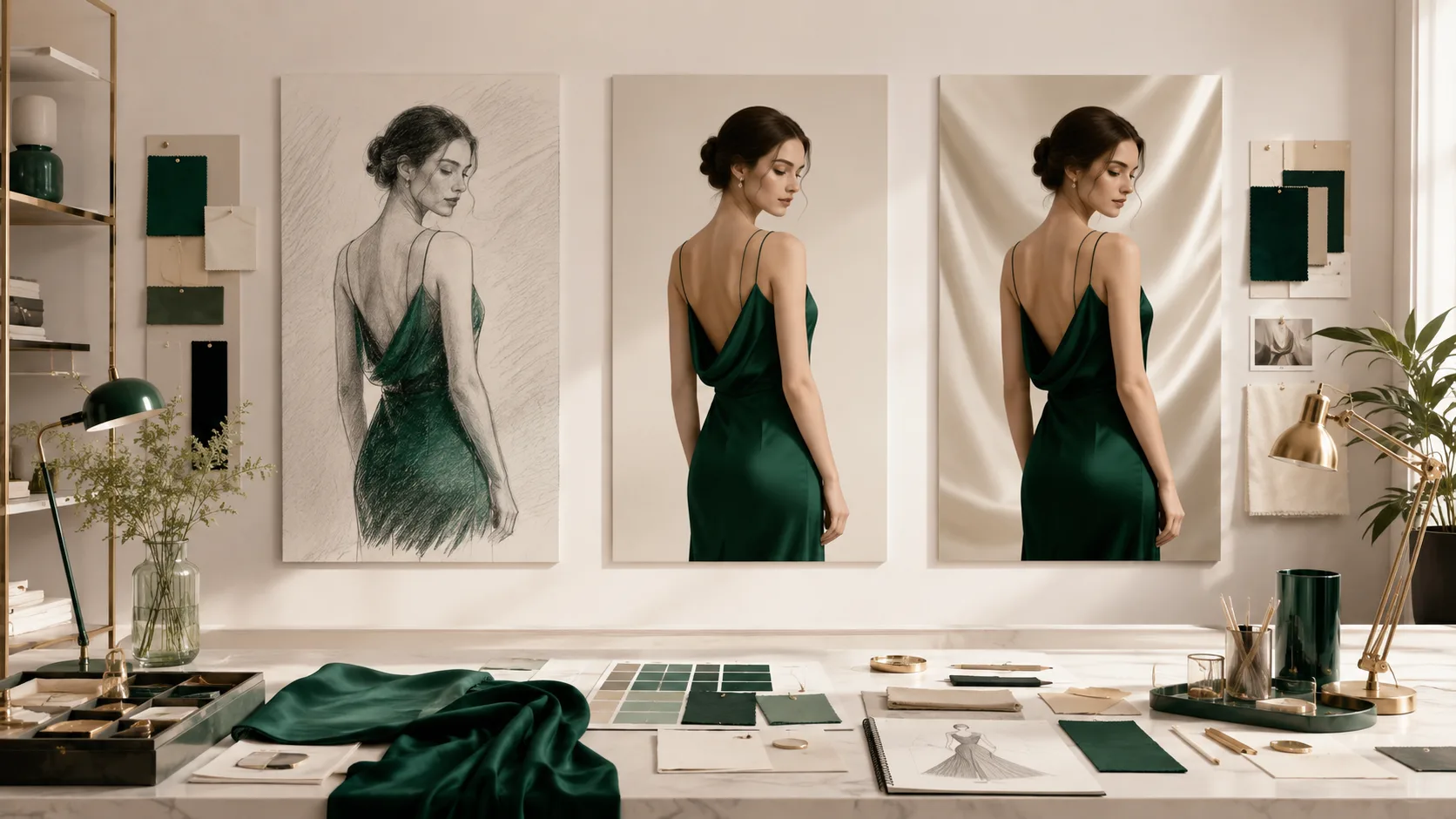
GPT Image 2 のこの利用場面における生成効果とワークフロー上の価値を示します。
GPT Image 2 は、完成度、階層、文字レイアウト、商用感が重要なブランドポスター、商品レイアウト、編集ビジュアル、インフォグラフィック、複数コマのストーリーに向いています。
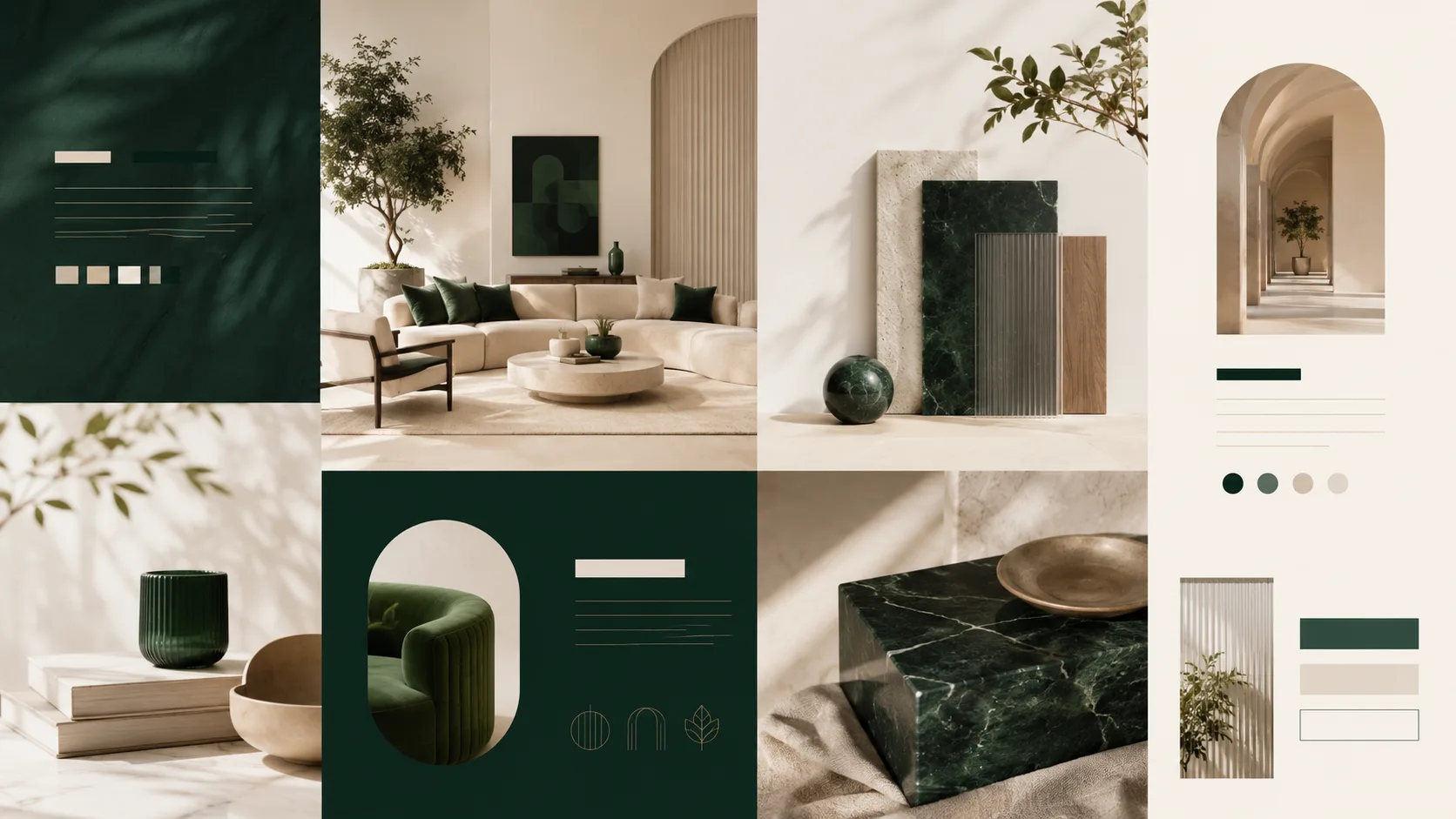
GPT Image 2 のこの利用場面における生成効果とワークフロー上の価値を示します。
デザイナーへの依頼文のように書きます。アセット種別、用途、対象者、レイアウト、文字位置、素材感、カメラ、色、余白、変えてはいけない条件を早めに示してください。
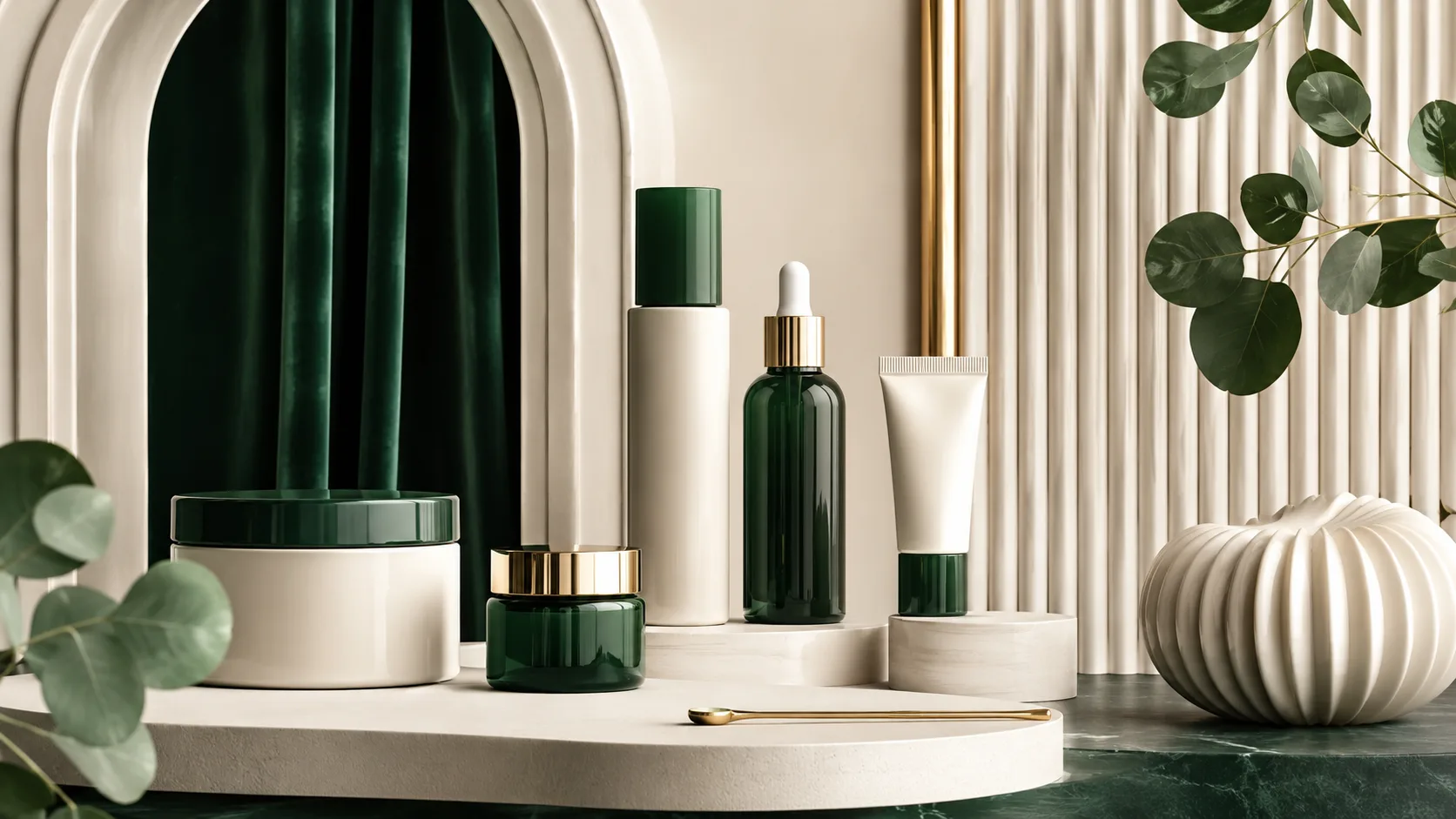
GPT Image 2 のこの利用場面における生成効果とワークフロー上の価値を示します。
GPT Image 2 が対応する品質、プロンプト、参照画像、出力設定が目的に合うときに使います。構図、文字、維持する要素を先に明確にします。
生成ケース
これらのケースは GPT Image 2 の典型用途に絞り、生成前後の変化を比較しやすくしています。
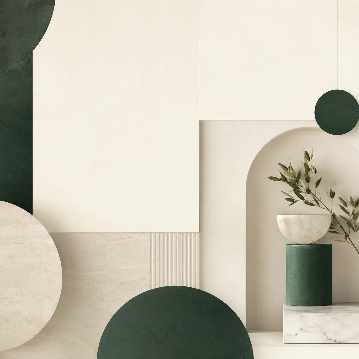
ケース 1
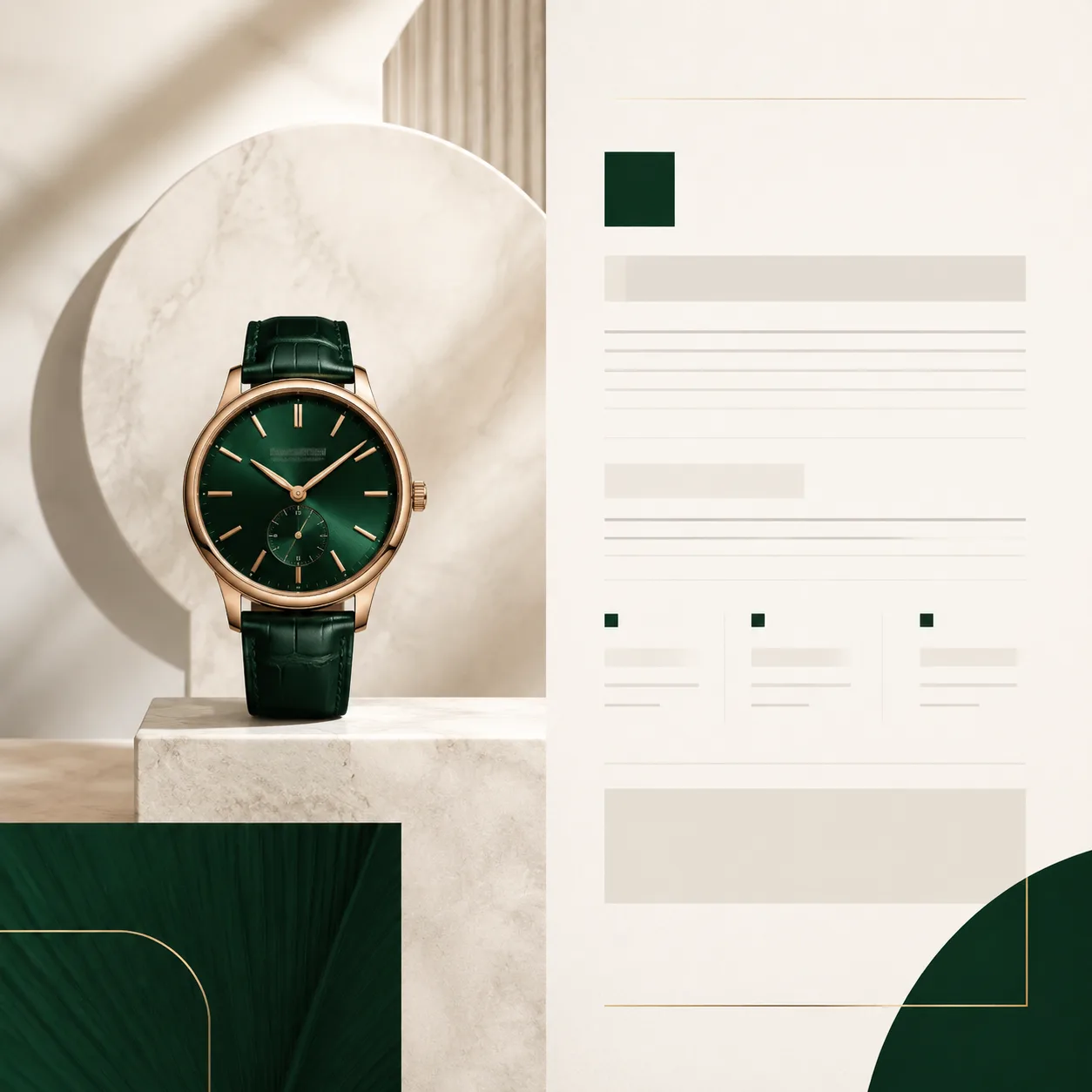
GPT Image 2 による生成前後の変化を比較します。
ケース 2
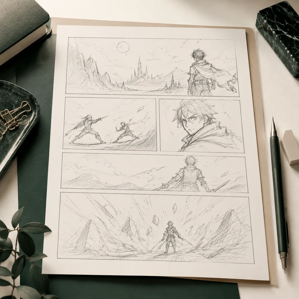
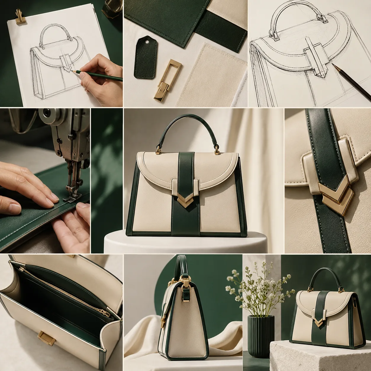
GPT Image 2 による生成前後の変化を比較します。
ケース 3
GPT Image 2 による生成前後の変化を比較します。
モデルギャラリー
GPT Image 2 の品質段階、複雑なプロンプトへの応答、レイアウト理解、商用向けの仕上がりに焦点を当てます。
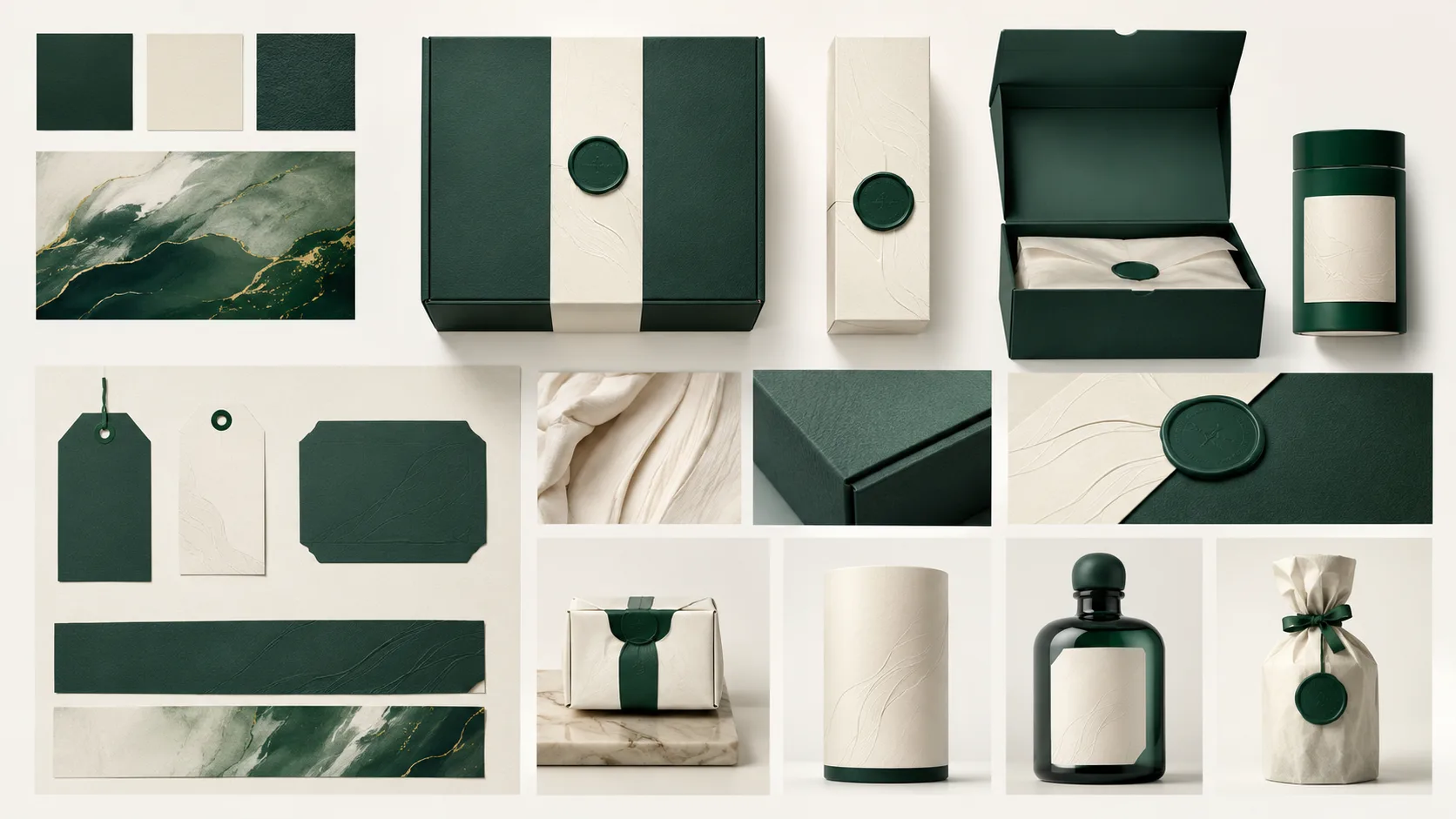
主な強み
1 / 5GPT Image 2 のこの利用場面における生成効果とワークフロー上の価値を示します。
プロンプト例
このモデルの実際のプロンプトケースを閲覧し、ケースを開いてプロンプトをコピーするかジェネレーターで再利用。
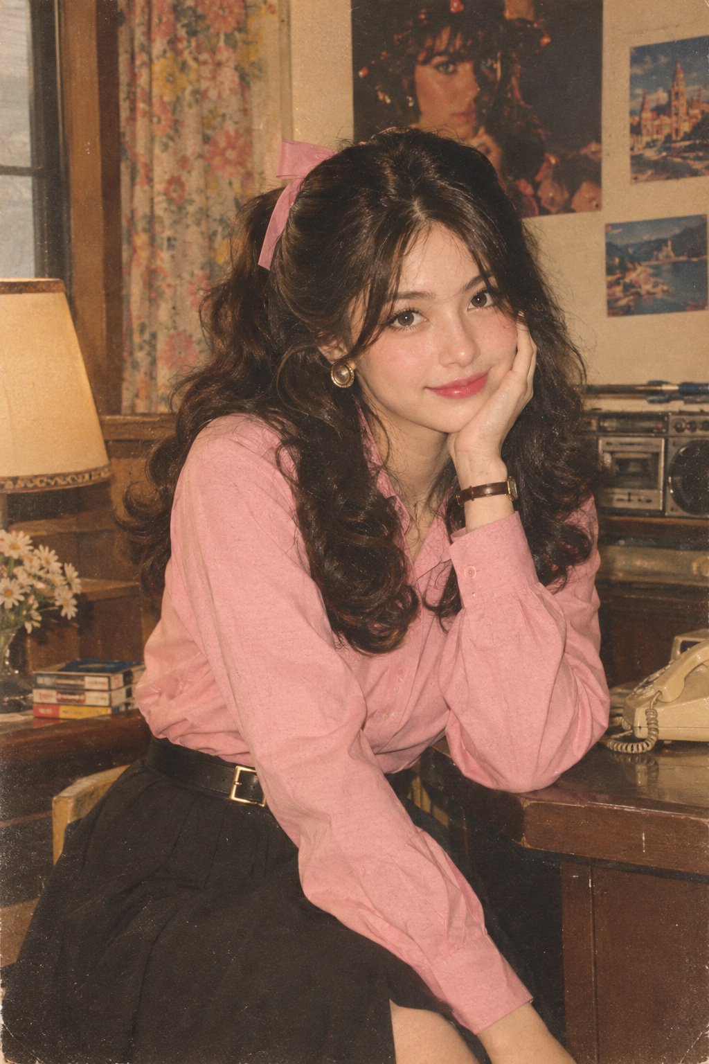
1980年代インド風ファッションポートレート
Let’s join the trend 😀 Prompt: Transform my photo into an authentic 1980s retro Indian fashion portrait, inspired by the reference image. Keep the exact face, facial features, face structure, skin tone, identity, and natural proportions unchanged. Do not alter or beautify the face. Dress her in a full-sleeve pink shirt tucked neatly into a black high-waisted skirt with a stylish belt. Remove the scarf completely. Add simple 1980s-inspired accessories. Give her bouncy, voluminous retro hair styled with a cute ribbon. Create an authentic 1980s background and atmosphere. Use a Kodak film-camera look with warm faded colors, subtle film grain, soft analog texture, gentle vintage lighting, and natural skin texture. Make it look like a genuine photograph taken in the 1980s, not a modern photo with a vintage filter. No watermark, no text, no distortion.
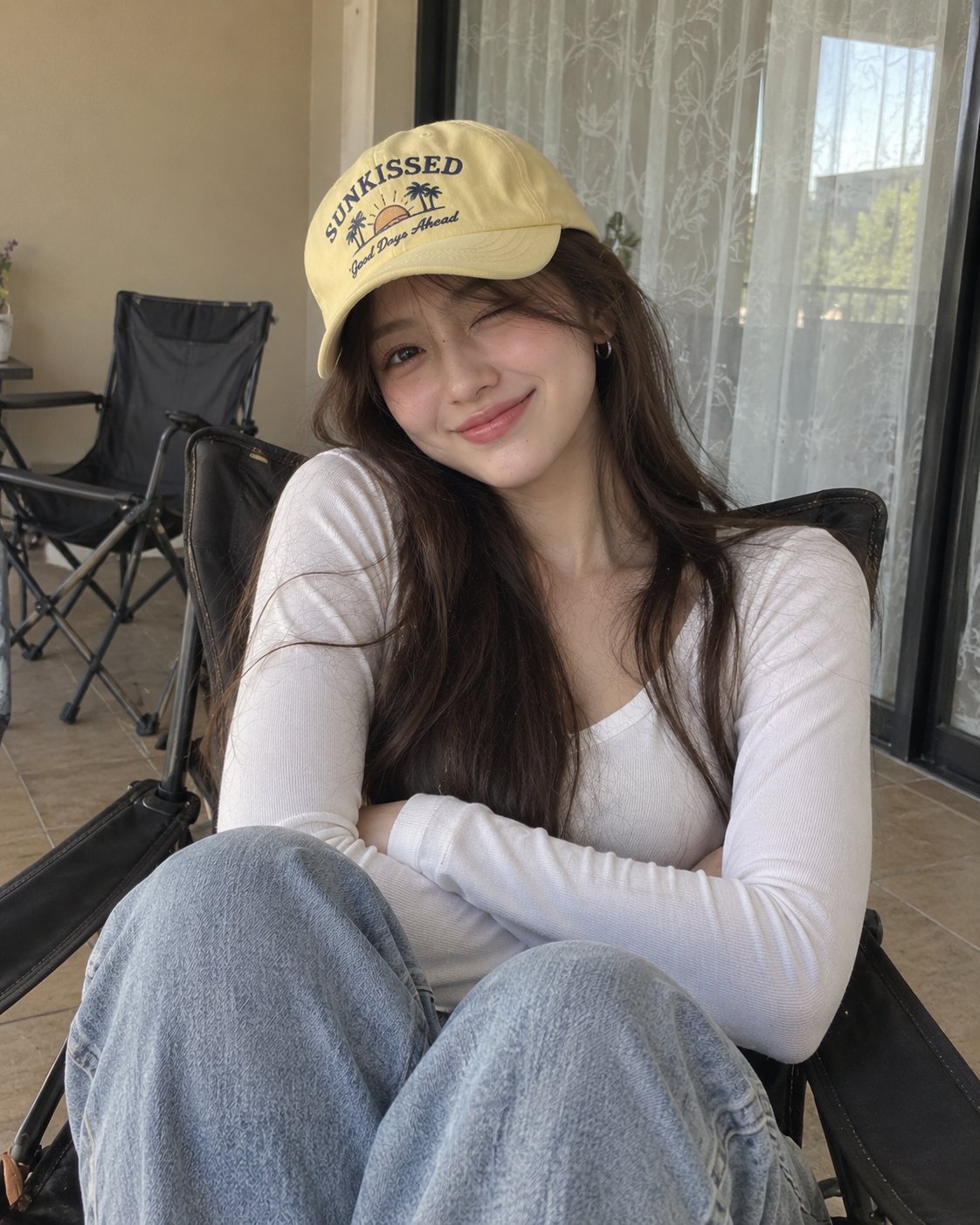
居室内のカジュアルな女性ポートレート
Crafted by GPT image 2 Prompt: Ultra-realistic casual portrait of a young woman sitting comfortably in a dark folding lounge chair, photographed indoors with a smartphone. She has long, straight dark-brown hair falling naturally over her shoulders, soft facial features, smooth natural skin, dark expressive eyes, and a warm playful smile with her eyes gently squinting. She wears small silver hoop earrings and a pale yellow baseball cap with a playful vintage graphic and lettering on the front. She is dressed in a simple fitted white long-sleeve V-neck top and light blue relaxed-fit jeans. Her arms are comfortably crossed over her torso, creating a relaxed and confident pose. She is seated with her knees slightly raised toward the camera. The setting is a cozy indoor balcony or casual room, with a beige wall, a large window covered by sheer patterned curtains, tiled floor, and dark folding chairs in the background. Soft natural daylight enters through the window, producing even illumination and gentle shadows. Authentic smartphone photography, candid lifestyle aesthetic, natural skin texture, realistic hair strands, detailed clothing fabric, subtle imperfections, soft neutral color palette, relaxed youthful mood, shallow depth of field, realistic proportions, photorealistic, high resolution, vertical 4:5 composition. Negative prompt: cartoon, anime, CGI, plastic skin, excessive makeup, distorted face, asymmetrical eyes, malformed hands, extra fingers, unnatural pose, unrealistic hair, blurry subject, oversaturated colors, warped background, excessive retouching, text artifacts, watermark.
編集用ポスター:写真とミックスメディア
GPT image 2 on chatgpt Prompt Create a premium editorial art poster for every uploaded photograph, treating each image as its own independent composition and never merging multiple photos together. Use a strict 3:4 vertical format with the canvas split into two perfectly equal horizontal halves: the upper half should remain a faithful, photorealistic presentation of the original image, preserving the subject’s exact identity, facial features, proportions, pose, clothing, objects, composition, lighting, shadows, mood, and natural colors, enhanced only with sophisticated editorial color grading and seamless environmental extension where necessary; the lower half should transform the visual story into an entirely different artistic interpretation—a tiny, carefully composed handmade mixed-media artwork centered within expansive warm ivory negative space, occupying no more than 10–20% of the lower section, using expressive ink sketching, layered gouache-like color fields, subtle collage textures, torn-paper edges, imperfect brushwork, visible fibers, soft pigment variations, and charming human imperfections while retaining the most recognizable silhouette, gesture, objects, and emotional narrative from the original photo. Extract up to four dominant harmonious colors from each photograph and reinterpret them in a muted, sophisticated palette. Add only occasional understated editorial typography when it genuinely enhances the composition, such as a poetic title, place, date, or single word. The overall result should feel like a collectible contemporary art publication cover—minimal, poetic, tactile, elegant, emotionally quiet, visually distinctive, and unmistakably connected to its original photograph.
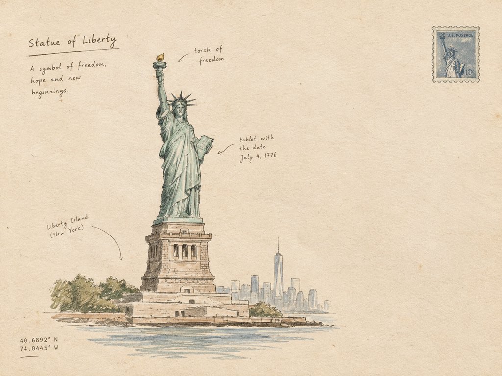
ミニマル手描き建築イラスト
Create a minimal hand-drawn architectural artwork of [STRUCTURE] on warm ivory paper. Show the structure as a simple, elegant ink sketch with clean imperfect lines, subtle pencil shading, tiny handwritten annotations, and a few delicate architectural details. Keep the composition airy with plenty of blank space, muted earthy tones, soft paper texture, and an authentic handmade travel-journal feel. No photorealism, no heavy details, no clutter — simple, artistic, and refined.
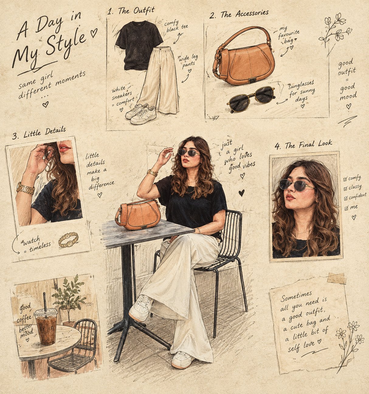
手描きレシピのイラストフレーム
Turn the main subject into a visual story told through 4–6 small illustrated frames. Keep the original object recognizable, but reinterpret it as a charming hand-drawn sequence showing its ingredients, preparation, texture, and final form. Use a warm cream paper background, delicate ink outlines, subtle handwritten annotations, tiny arrows, ingredient sketches, measurement marks, and imperfect print textures. The composition should feel like a page from an old culinary sketchbook — artistic, intelligent, nostalgic, and highly curated. Do not simply reproduce the photograph. Transform its subject into an illustrated visual narrative.
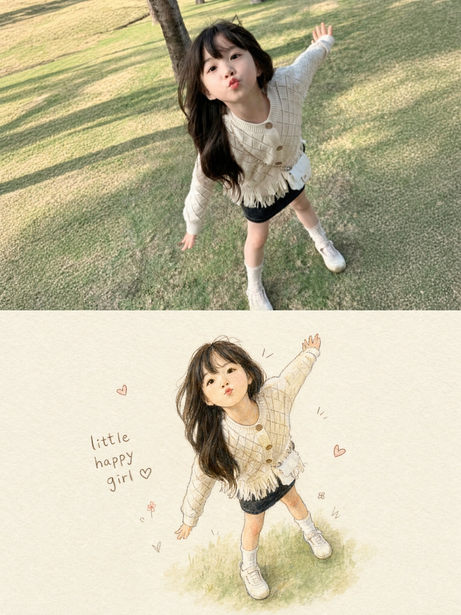
写真とイラストの組み合わせ作品
Create a single vertical 3:4 PHOTO + HAND-DRAWN ILLUSTRATION artwork based ONLY on the uploaded photograph. Use the uploaded photograph as the ONLY visual reference. Analyze the photograph independently and reproduce the exact subject, pose, expression, clothing, hairstyle, accessories, objects, proportions, and overall moment in the illustration. Do not introduce elements from any previous image or reference. TOP — ORIGINAL PHOTOGRAPH Use approximately the upper 50% of the canvas for the original photograph. Preserve the photograph faithfully and naturally: - Keep the original subject exactly recognizable. - Preserve the face, expression, hairstyle, clothing, accessories, pose, body proportions, and visible objects. - Preserve the original environment and composition. - Do not retouch, beautify, replace, or redesign the subject. - Keep the photograph realistic with its original lighting, colors, textures, and details. BOTTOM — HAND-DRAWN ILLUSTRATION Use approximately the lower 50% for a charming handmade illustration of the SAME photograph. Transform the photographic moment into a delicate children's storybook-style hand-drawn artwork. Illustration style: - Soft watercolor and colored-pencil texture - Gentle pencil/ink outlines - Slightly imperfect handmade strokes - Warm, tactile off-white textured paper - Soft natural shading - Subtle watercolor washes - Cute, expressive, wholesome appearance - Delicate handcrafted imperfections - No glossy digital-rendered appearance - No photorealism - No 3D CGI - No anime or cartoon franchise style Most importantly, accurately preserve the subject from the photograph: - Same pose and body position - Same facial expression - Same hairstyle - Same clothing and clothing patterns - Same shoes/accessories - Same proportions - Same distinctive visual details - Same overall action or mood Simplify the background substantially. Do not recreate every background detail. Keep only a very subtle suggestion of the original environment, allowing the illustrated subject to remain the main focus. Place the illustrated subject slightly smaller than the photograph's subject, surrounded by generous negative space. MINIMAL DECORATIVE DETAILS Add a few tiny hand-drawn decorative marks around the illustration, such as: - small hearts - simple motion lines - tiny doodles - subtle stars or flowers Keep these decorations sparse and tasteful. Add a small handwritten caption near the illustration, such as: "little happy girl ♡" The caption should look naturally handwritten with a casual brown/gray pencil or ink texture. If the uploaded subject is not a girl, automatically adapt the wording appropriately or omit the caption entirely. OVERALL AESTHETIC The final artwork should feel like a precious memory transformed into a page from a handmade children's picture book. Composition: - Vertical 3:4 - Clean separation between photograph and illustration - Soft warm editorial presentation - Large amount of negative space around the illustration - Minimal, elegant, sentimental - Premium handmade stationery / illustrated scrapbook aesthetic CRITICAL RULE: The uploaded photograph is the sole source of truth. Do not invent, substitute, merge, or carry over any person, clothing, object, background element, color, pose, or detail from another image. The bottom illustration must clearly look like a hand-drawn version of the EXACT moment shown in the top photograph. REFERENCE PRIORITY: 1. Exact subject and pose 2. Facial expression and hairstyle 3. Clothing and accessories 4. Overall composition 5. Illustration style 6. Minimal decorative elements Never sacrifice subject accuracy for artistic stylization.#Lovart #LovartPartner
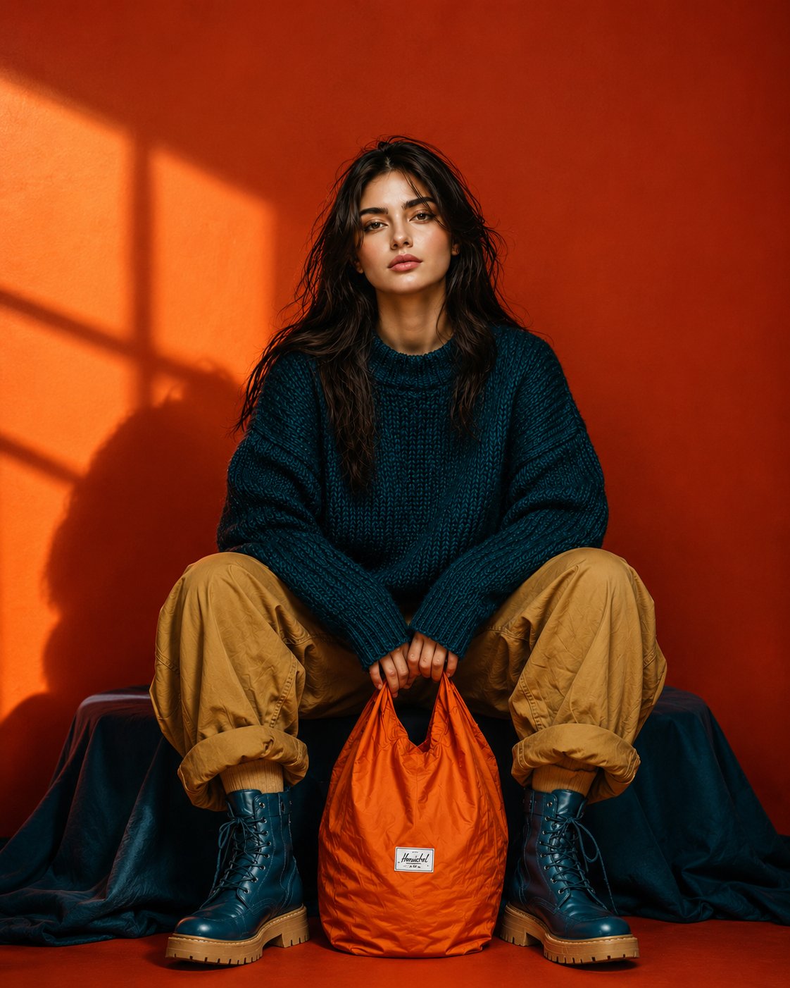
オーバーサイズセーター姿の女性ポートレート
Ultra-realistic full-body editorial fashion portrait of a beautiful young woman sitting low in a relaxed wide-leg pose, knees raised and slightly apart, both hands naturally holding the handles of a bright orange nylon tote bag positioned between her feet. Keep her facial identity and facial proportions exactly consistent with the reference image, long slightly messy dark-brown hair, natural skin texture, minimal makeup, calm confident expression, no glasses. She wears an oversized chunky deep-teal knitted sweater, loose camel/tan cargo pants with casually rolled cuffs, and chunky dark-teal lace-up combat boots with warm tan soles. Bold burnt-orange studio background with dramatic golden sunlight creating geometric window shadows across the wall. Strong teal, orange and camel color blocking, rich saturated colors, stylish but not overly glamorous. Centered symmetrical composition, slightly low camera angle, full body completely visible, relaxed editorial posture, realistic fabric textures, subtle imperfections, cinematic directional lighting, crisp details, premium contemporary fashion campaign photography, natural proportions, photorealistic, 9:16 vertical.
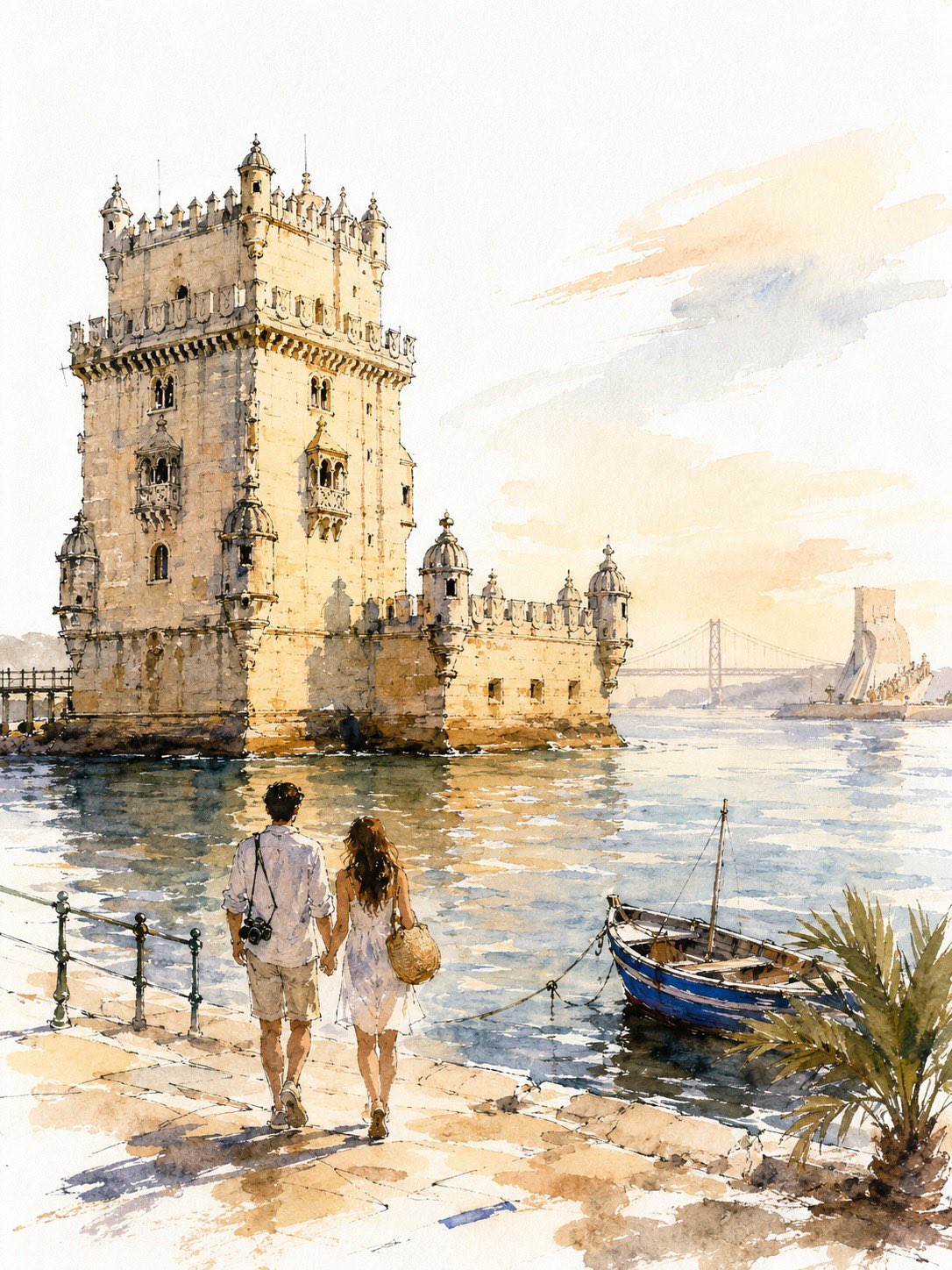
ニューヨーク旅行スケッチ 水彩墨絵
A loose, unfinished watercolor-and-ink travel sketch of New York: fast broken line, uneven washes, generous bare paper, golden-hour light. SUBJECT Hero: the Empire State Building from street level, frontal and slightly upward-tilted, full height inside the frame, 68–75% of poster height, anchored on the right third, base in the lower-middle third. Behind it: the Chrysler crown, small and low left, plus 2–3 soft masses standing in for Midtown. Nothing else — no Liberty, no Brooklyn Bridge, no Times Square. Bright white cold-press paper, no cream or sepia cast. IDENTITY LOCK — the only sustained drawing in the image (a) stepped Art Deco setbacks narrowing in stages toward the top (b) continuous vertical piers with recessed window bands — long strokes, never individual windows (c) the tiered crown lantern with mooring mast and antenna These carry the strongest contrast, are never cropped, never fade to blank paper. COUPLE A young couple seen from behind, arms linked, walking up the avenue, one glancing up at the tower. 14–18% of poster height, in the bottom 22–25% band. Mid-century-cut travel coats; a small handbag, a compact suitcase. 10–15 strokes each — silhouette, hair mass, coat line, legs. No faces, no fingers, no folds, no third figure. The most resolved human element in the image. LINE Contours break, skip, overshoot corners, and stop before meeting; weight varies within a single edge. Background architecture is gestural only — a roofline, a corner, an implied vertical. If a building reads in 5–8 strokes, stop at 8. Never window-by-window, never brick. Some forms exist as wash alone, no line. WATERCOLOR Never fill evenly. Within one surface the wash swings from deep pooled pigment on one side to bare paper on the other. Blooms and backruns with cauliflower edges, wet-in-wet bleed, hard pooled edges beside dissolved ones, dry-brush skips, granulation in the grain. Washes overshoot the ink by 5–10% in places and fall short elsewhere. No object is uniformly colored. Coverage 55–65%: leave bare paper across most of the sky, the distant city, sunlit faces, the outer 10–15% of the frame, and gaps in the pavement. Bare shapes are brush-formed and irregular, never rectangular. VALUE 6–10 fingernail-sized darks in burnt umber or dark indigo — setback shadows, window bands, under the awning, beneath the taxi and the couple, tower base. Drop them into damp wash so they bloom. Without these the image is a flat pastel smear. DEPTH Foreground strongest pigment and clearest line; distance at 15–25% pigment in dusty blue-gray and hazy peach with almost no line, grouped into 2–3 masses. LIGHT & COLOR Golden hour, light raking from the left so the tower has a lit face and a shaded face. Sky: 3–5 broad strokes, the rest bare paper, no detailed clouds. Warm limestone cream, pale apricot, warm gray, dusty steel blue, soft graphite. One saturated accent: taxi yellow. Props, 3 only — a yellow cab from behind, a lamp post, a striped awning edge. TEXT None anywhere: no title, caption, signage, storefront name, street sign, number, logo, or pseudo-lettering. Signs become abstract shapes. The top 15–18% stays clean and empty for titling added later. AVOID Photorealism, CGI, 3D render, generic AI architecture, hybrid or duplicated towers, extra setbacks, warped façade, repeating-window artifacts, mechanically even line weight, floating objects, roads into walls, inconsistent scale, visible faces, extra figures, flat even fills, uniform contrast at all distances, edge-to-edge painting, neon color, garbled text. Bare paper beats invented detail — everywhere except the identity features. RECOGNITION FIRST, VALUE SECOND, ATMOSPHERE THIRD, DETAIL LAST.
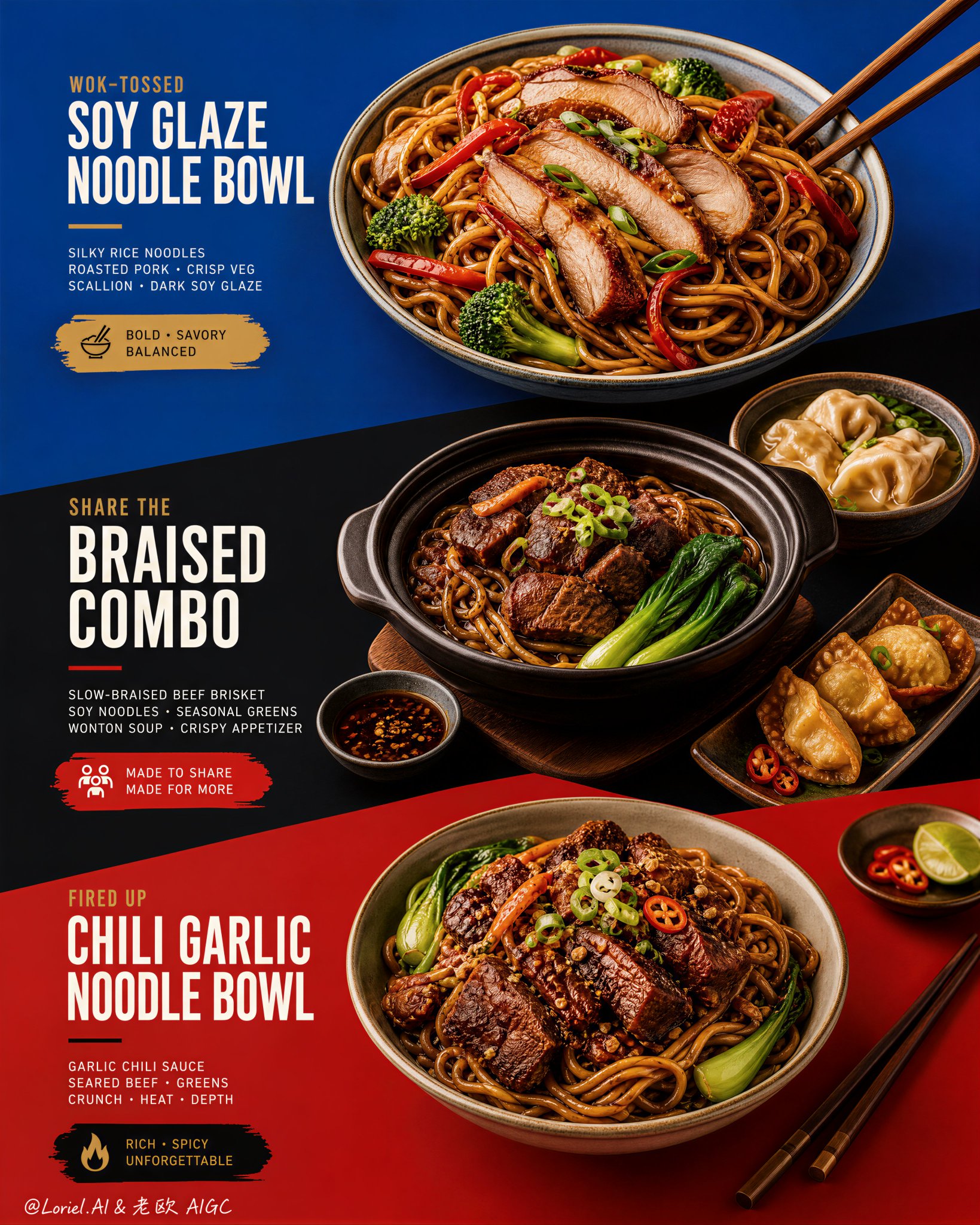
カイソン丼をテーマにしたメニューポスター
This kind of menu poster works only when the color blocks do real layout work. Blue, black, and red should not be background decoration. They need to act like three stages, each one holding a different offer and pushing the eye downward through the poster. 🔷 three stacked color fields with strong diagonal transitions guiding the viewer from dish to dish This gives the menu a clear scan path. You see the top bowl first, then the sharing combo, then the richer bottom bowl, without the layout turning into a crowded food collage. 🥢 food placement and chopstick angles echoing the diagonal color-block geometry This makes the food feel designed into the poster. The bowls, side dishes, and utensils reinforce the same direction as the graphic cuts, so everything feels intentional instead of randomly placed. GPT- image 2 prompt👇 Create an ultra-premium restaurant advertising poster that merges Orbit-style compositional force with Transit-style international polish, preserving the exact structural logic of a bold color-block menu poster while refining it into a cleaner, sharper, more globally premium flagship campaign. Use a tall vertical layout divided into three large graphic color fields with strong angled transitions, where each color block acts as a compositional stage for a specific hero dish or combo. The final artwork must feel bold, graphic, craveable, modern, and Cannes-level commercial, with the food and color planes fused into one precise design system. Do not copy any original text, logo, pricing, or wording. Core composition: Use a vertical poster layout with three major stacked sections connected by strong diagonal or slanted color-block cuts. Top section: a premium blue field featuring one hero stir-fried rice noodle bowl. Middle section: a deep black-charcoal field featuring one larger family combo or shared meal composition. Bottom section: a rich red or terracotta-red field featuring a second hero noodle bowl. The transitions between color fields must feel sharper, more directional, and more deliberate, so the eye travels through the poster in one continuous graphic rhythm. Orbit enhancement: Push the structural energy of the color blocks much harder. The diagonal cuts between blue, black, and red should feel more assertive, almost slicing through the page and directing the viewer’s attention from top hero bowl, through the middle combo, into the lower bowl. The placement of bowls, chopsticks, and side dishes should echo these diagonal vectors, so the food itself appears orchestrated by the color geometry. The poster should feel more immediate and more visually aggressive from a distance. Transit enhancement: Refine the entire poster into an international flagship restaurant-advertising language. Use purer, more controlled color fields, cleaner typography spacing, calmer negative space, and more elegant hierarchy. The blue should feel fresher and more premium, the black deeper and more sophisticated, and the red more refined and less noisy. The result should feel like a global fast-casual or modern Asian dining brand campaign rather than a crowded local promo poster. Food and color-block integration: This is the most important feature. The dishes must feel inseparable from the color fields. Each bowl must sit in its section with exact compositional intention, using plate placement, garnish direction, chopstick angle, and nearby side elements to reinforce the graphic planes. The color blocks should not be passive backgrounds; they must actively frame, support, and sharpen the food presentation. Top hero bowl: Show a premium soy-glazed or stir-fried rice noodle bowl with glossy noodles, sliced roasted pork or chicken, red pepper strips, broccoli, scallions, and rich dark sauce sheen. The bowl should feel fresh, balanced, and immediately appetizing against the vivid blue field. Middle combo section: Show a richer, more abundant combo arrangement in the black-charcoal section: one deep bowl or clay pot with braised meat and noodles, plus one or two supporting side dishes such as soup, dipping bowl, or appetizer plate. The composition should feel generous but controlled, like a hero combo set for sharing. The darker section should make the warm food highlights glow more dramatically. Bottom hero bowl: Show a second noodle variation with deeper glaze, richer meat topping, greens, scallions, and carefully layered garnish. This lower bowl should feel slightly heavier and more indulgent, anchored powerfully against the red field. Typography system: Use bold, modern, highly legible menu typography integrated precisely into each section. Main dish names should be large, confident, and clean. Price blocks should sit inside compact contrasting graphic capsules or bold painted labels. Supporting copy must be short, sharp, and minimal. All wording must be fully original and fictional. Typography must align with the color-block structure and never float loosely. Lighting: Use bright premium food-commercial lighting with warm directional clarity and controlled highlights. The noodles must show moist elasticity, the meat should catch caramelized gloss, and vegetables should remain fresh and crisp. Keep the lighting polished and appetizing, but clean enough that the graphic composition remains dominant. Material rendering: Render noodles with springy tension and sauce sheen, meats with rich caramelized texture, vegetables with natural freshness, eggs or tofu if included with convincing surface detail, ceramic bowls with subtle glaze reflections, and chopsticks with elegant wood texture. The color fields should feel matte, flat, and graphically strong, contrasting with the realism of the food. Background and cleanliness: Keep the entire poster highly controlled and clean. No unnecessary pattern overload, no cluttered prop styling, no random elements outside the color-block logic. The graphic planes and food should carry the entire story. Color system: Use a disciplined premium palette of saturated but controlled blue, deep black-charcoal, refined terracotta-red, noodle gold, roast mahogany, scallion green, citrus green accents, and small off-white typography. The color blocks must feel bolder and more premium, while the warm food tones unify the poster. Image finish: The final poster must feel like a world-class flagship restaurant campaign: bold, directional, graphic, product-led, internationally polished, and instantly memorable. Preserve sharp food detail, precise color-block edges, elegant typography hierarchy, and immaculate commercial retouching. 8k, premium restaurant advertising quality. Negative prompt: copied text, copied pricing, copied logo, cluttered layout, weak color blocks, muddy food texture, limp noodles, greasy mess, random props, poor typography hierarchy, dirty background, black blotches, low-resolution food detail
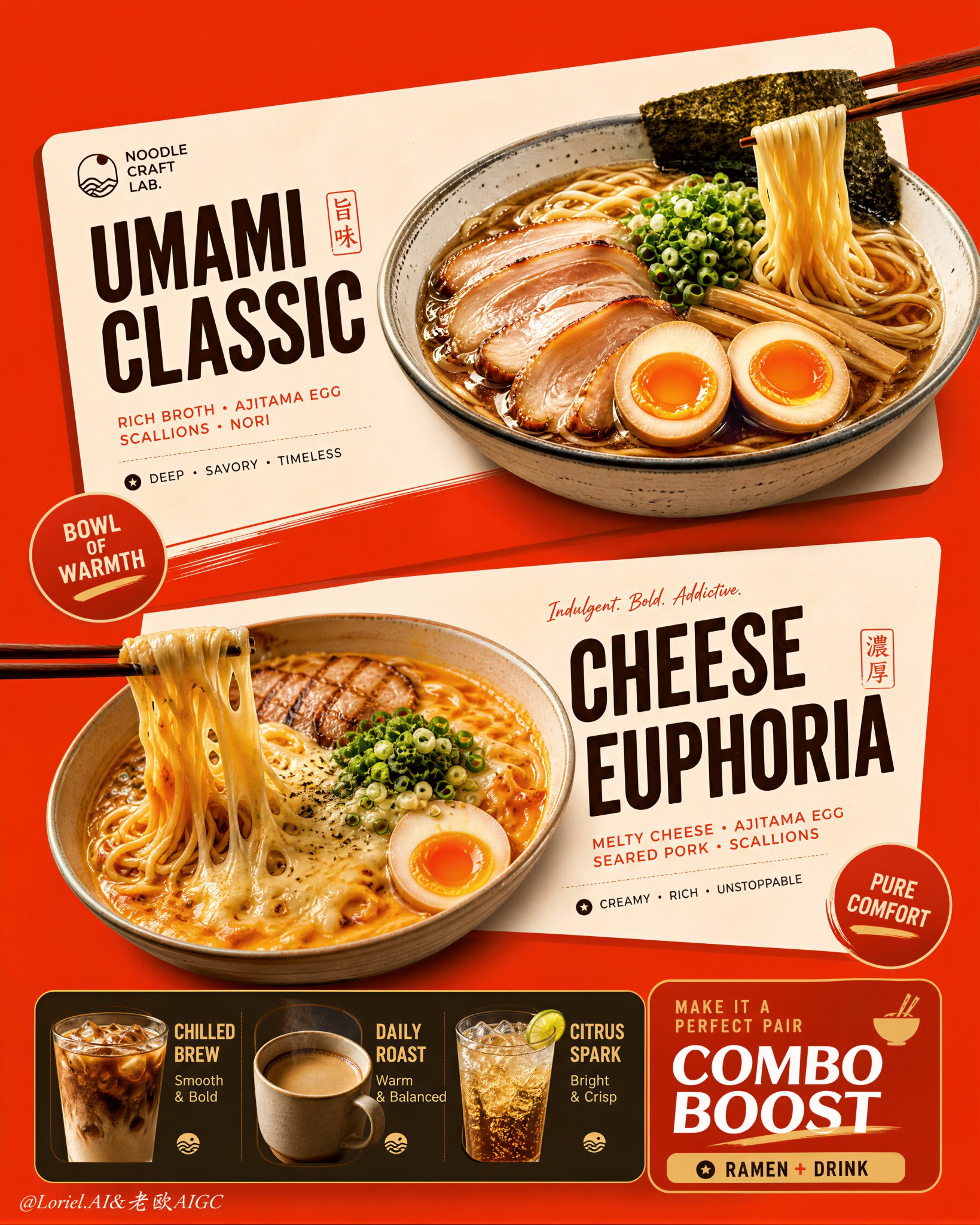
ラーメン店のカード式メニューポスター
This poster works because the menu is built as cards, not as scattered food and text. The angled cream blocks do the organizing: each ramen gets its own stage, while the bottom strip handles add-ons without stealing attention from the two hero bowls. 🍜 two large cream-toned angled menu cards floating over a saturated orange-red background This creates instant hierarchy. You see offer one, offer two, then the supporting combo strip, because the cards separate the information before the text even matters. 🥢 bowls, chopsticks, badges, and typography aligned to the same slanted card geometry This keeps the density clean. The food, labels, and graphic shapes all lean in the same direction, so the poster feels energetic without becoming messy. GPT- image 2 prompt👇 Create an ultra-premium vertical restaurant advertising poster that merges Orbit-style compositional force with Transit-style international polish, preserving the exact logic of a bold ramen combo menu while refining it into a cleaner, sharper, more globally premium flagship campaign. Use one dominant saturated orange-red background field and build the poster around two large cream-toned angled menu-card blocks floating through the center, each framing one ramen hero dish, with a compact drink-combo strip anchored along the bottom. The final image must feel graphic, hot, craveable, modern, and commercially irresistible, with the food and color-block geometry fused into one exact system. Do not copy any original text, logo, price, or wording. Core composition: Use a strict vertical poster architecture with three main beats: 1. a bold upper hero card featuring one ramen bowl, 2. a second slightly offset lower hero card featuring another ramen bowl, 3. a compact bottom combo strip featuring three drinks and one combo-offer zone. The orange-red field must act as the dominant visual stage, while the cream menu-card blocks slice across it with more deliberate angled placement. The whole poster must read instantly as a strong graphic food composition. Orbit enhancement: Push the card geometry harder. The two large cream cards should feel more decisively slanted and more dynamically offset, as if they are thrusting the food forward through the page. The bowls, price badges, and chopstick directions should align with these card angles so the entire poster feels driven by one aggressive compositional motion. The upper and lower ramen heroes should feel like two strong visual hits in a diagonal rhythm. Transit enhancement: Refine the whole image into a more international flagship restaurant-advertising language. Make the orange-red field cleaner and more premium, the cream cards softer and more elegant, the typography more disciplined, and the supporting elements more restrained. Reduce unnecessary icon clutter and decorative noise. The result should feel like a global fast-casual or modern Asian dining brand campaign with polished international art direction. Upper ramen hero: Show one premium ajitsuke tamago-style ramen bowl with rich glossy broth, springy noodles, a halved jammy egg, chopped scallions, and dark nori. The bowl should feel warm, comforting, and immediately craveable. Place it confidently within the upper cream card so the bowl, title zone, and price badge feel locked together. Lower ramen hero: Show one indulgent cheese-and-egg ramen variation with melted cheese stretching from lifted noodles, glossy broth, sliced meat or chashu, chopped scallions, and halved egg. The cheese pull should be clean, appetizing, and visually dramatic. Place the bowl so it balances the lower card while still feeling contained by its geometry. Drink combo strip: At the bottom, include a narrow premium combo strip with three compact drink modules: - iced coffee, - hot coffee, - cold soda or sparkling drink. These should feel like clean supporting products, each inside simple rounded or capsule-like graphic areas. Add one strong combo-value block to anchor the strip, but keep the entire bottom section tight, clean, and secondary to the two ramen heroes. Typography system: Use bold modern display typography with strong hierarchy and clean scanning logic. Dish names should be large and high-contrast. Price elements should sit in compact circular or capsule badges. Supporting lines should be short and minimal. All wording must be fully original and fictional. The typography must align tightly with the cream card structures and feel globally polished. Color-block integration: This is the most important feature. The food must feel inseparable from the color blocks. The orange-red background and cream cards must not behave like passive backgrounds; they must actively shape the poster, frame the dishes, direct the eye, and create rhythm. Bowls, chopsticks, price tags, and text must all appear intentionally positioned according to the card angles and color boundaries. Lighting: Use bright premium food-commercial lighting with warm directional clarity. Broths must glow with rich sheen, noodles must feel elastic, eggs must show soft yolk richness, and cheese must feel molten and luxurious. The drinks should show clean reflections and believable temperature cues. Keep lighting appetizing but controlled so the graphic structure remains dominant. Material rendering: Render ceramic bowls with subtle glaze reflections, broths with translucent depth, noodles with moist sheen, meats with caramelized texture, cheese with smooth melt physics, eggs with creamy yolks, and drinks with realistic ice, crema, or bubbles. The cream cards should feel matte and graphic, contrasting with the realism of the food. Background and cleanliness: Keep the poster tightly controlled and free of clutter. If any subtle texture appears in the orange-red field, keep it minimal and premium. Avoid unnecessary environmental storytelling. This must remain a graphic menu-poster composition first. Color system: Use a disciplined premium restaurant palette of orange-red, cream, warm beige, deep brown, black, noodle gold, broth mahogany, egg orange, scallion green, and coffee tones. The overall effect should be vivid, hot, and globally polished. Image finish: The final poster must feel like a world-class flagship ramen combo campaign: bold, graphic, product-led, appetizing, and commercially exact. Preserve sharp food detail, strong card geometry, clear typographic hierarchy, and immaculate commercial retouching. 8k, premium restaurant advertising quality. Negative prompt: copied brand names, copied pricing, copied slogan, cluttered menu text, weak card angles, weak color-block structure, muddy broth, limp noodles, fake cheese pull, greasy mess, random props, poor hierarchy, dirty background, black blotches, low-resolution food detail
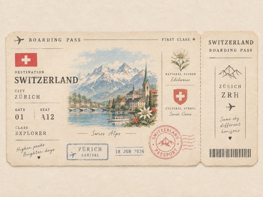
ミニマル派のバージタイルパスポートボーディングパス
Create a cute minimalist vintage passport boarding pass for [COUNTRY]. Feature a tiny illustrated iconic landmark as the main detail, with a miniature country flag, local flower, cultural symbol, destination code, passport stamp, date stamp, and tiny ticket details. Use warm ivory paper, soft muted pastel colors, thin vintage borders, subtle paper fibers, slightly faded ink, delicate typography, and lots of clean negative space. Make it look like a collectible passport keepsake from a charming journey — elegant, tiny, nostalgic, playful, and premium. Front-facing flat composition, balanced layout, no clutter, no collage, no photorealism. Ticket details can include: * DESTINATION: [COUNTRY] * CITY: [FAMOUS CITY] * GATE: [01] * SEAT: [A12] * CLASS: EXPLORER * STAMP: [COUNTRY] PASSPORT * DATE: 2026 * LANDMARK: [ICONIC LANDMARK]
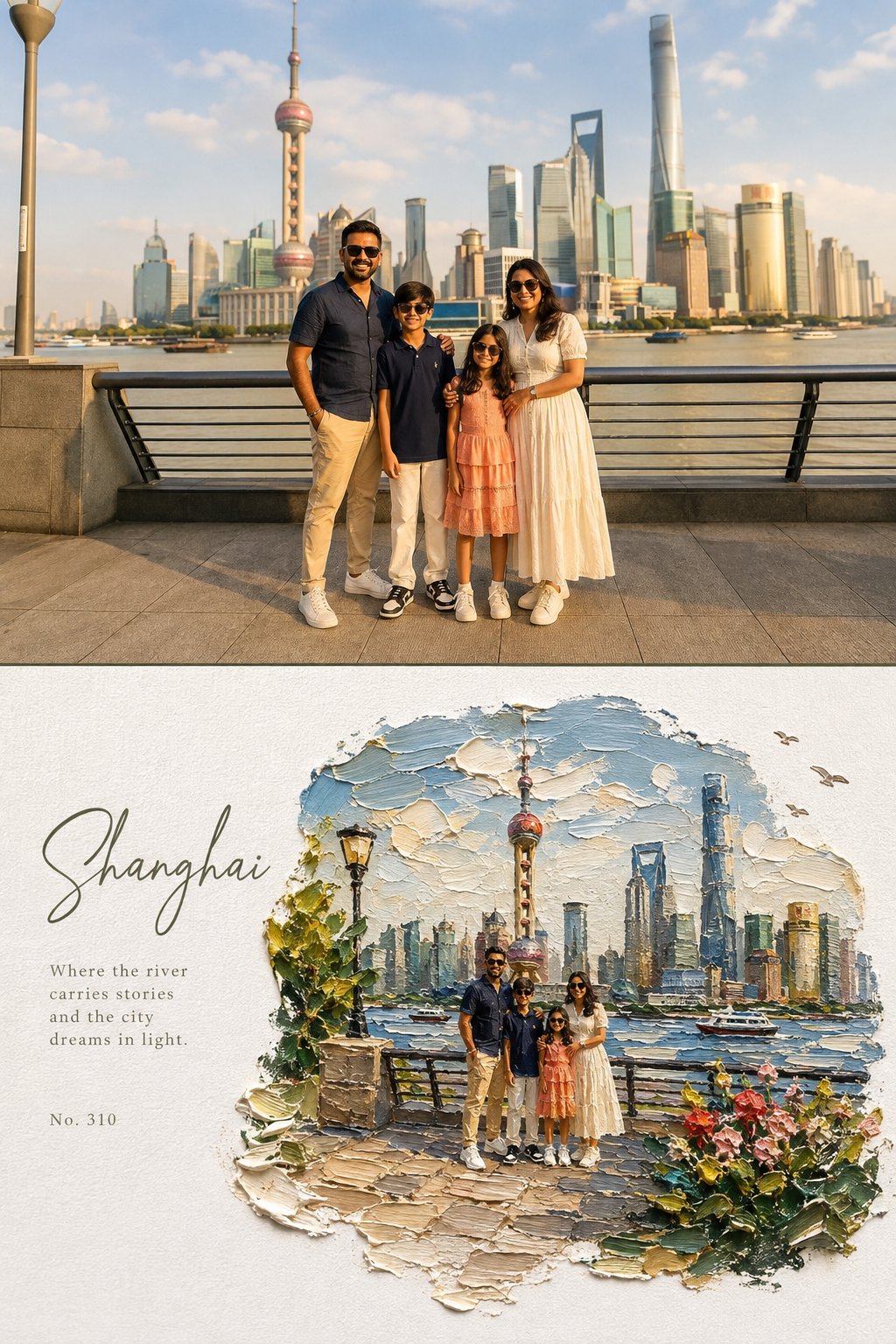
上半分は写真、下半分は水油絵のジオラマ風エディトリアルポスター
Create a high-end editorial art poster in strict 3:4 vertical format, divided horizontally into two equal 50% halves, with either a seamless join or a very thin divider. TOP — ORIGINAL PHOTO Preserve the photograph exactly: identity, faces, clothing, proportions, poses, expressions, and subject relationships must remain unchanged. Apply only a warm fine-art film grade with soft contrast, lifted shadows, warm highlights, natural vivid color, and subtle grain. Extend the background naturally if needed, without distorting subjects. Generous environmental space is encouraged. BOTTOM — IMPASTO MINIATURE WORLD Reimagine the same scene as a poetic miniature diorama made from extremely thick impasto oil paint on pure white textured paper. Keep subjects recognizable but make them tiny, figurine-like, preserving their poses, clothing colors, and key features. The painted world should occupy 60–75% of the lower half, surrounded by generous white negative space. Use organic, irregular, feathered paint edges, never a rectangular frame. Include sculptural palette-knife clouds, reflective water or a natural path, small flowers, grass, foliage, rocks, birds, distant scenery, and atmospheric light where appropriate. The environment may become slightly more idyllic and dreamlike. Make the paint thick, tactile, raised, and three-dimensional, with visible brush and palette-knife marks, paint ridges, drag textures, tiny shadows, and subtle translucent glazes. Keep the paper grain clearly visible. TYPOGRAPHY Place elegant typography only in the white space: a large handwritten calligraphy title, a short poetic subtitle, and a small reference number. Use refined olive green, warm gray, or soft blue-gray tones. Keep typography understated. COLOR & MOOD Use vivid, natural colors inspired by the photograph: sky blue, lake blue, green, warm yellow, coral, cherry red, peach, cream, and warm white. The overall feeling should be sunny, fresh, warm, joyful, relaxed, and dreamlike. Avoid: muted or muddy colors, sepia, dark-brown filters, fluorescent tones, flat digital art, smooth airbrush effects, plastic 3D rendering, hard borders, generic fonts, text over subjects, and distorted figures.
OpenAI showcase signal
これらの例は、上のジェネレーターで試しやすい GPT Image 2 向けプロンプトの方向として整理しています。
公式例
GPT Image 2 の公式例をもとに整理したプロンプト方向です。このジェネレーターで試しやすくしています。
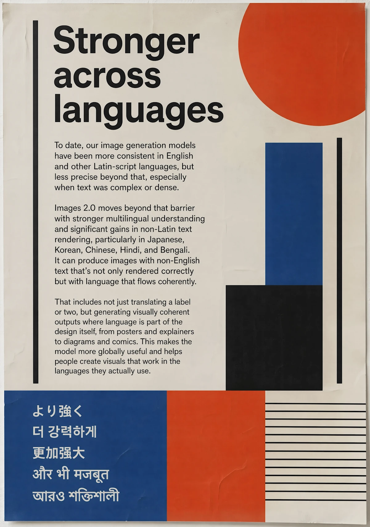
Design prompt
Create a bold editorial poster about stronger multilingual image generation, using geometric red, blue, black, and cream shapes, readable copy blocks, and multiple global scripts.
GPT Image operating notes
デザイナーへの依頼文のように書きます。アセット種別、用途、対象者、レイアウト、文字位置、素材感、カメラ、色、余白、変えてはいけない条件を早めに示してください。
GPT Image 2 は、完成度、階層、文字レイアウト、商用感が重要なブランドポスター、商品レイアウト、編集ビジュアル、インフォグラフィック、複数コマのストーリーに向いています。
デザイナーへの依頼文のように書きます。アセット種別、用途、対象者、レイアウト、文字位置、素材感、カメラ、色、余白、変えてはいけない条件を早めに示してください。
品質調整、読みやすい文字方向、商用品質、デザイン推論が必要なときに GPT Image 2 を選びます。速い方向探索だけなら Nano Banana 2 から試してもよいです。
プロンプト全体を書き直す前に、次の項目を確認してください。1回につき1つの条件だけを変えると、GPT Image 2の結果が改善した理由を判断しやすくなります。
必須の被写体、出力形式、維持する条件を冒頭に移し、矛盾するスタイル指定を削除します。生成ごとに変更する条件は1つに絞ってください。
参照画像で固定する対象を、人物、ポーズ、レイアウト、商品形状、スタイルのように明記し、GPT Image 2が変更してよい範囲も示します。現在のモードが参照入力に対応しているかも確認してください。
文言を短くし、表示する正確な文字、読む順序、パネル数、文字位置を先に指定してから装飾スタイルを加えます。
用途に合う解像度または品質設定を選びます。まず低コストの下書きで構図を固め、最後に大きな出力を生成してください。
クリエイターの声
日々の投稿づくりからクライアント向けのたたき台まで、異なる立場の8人が率直な感想を寄せました。
“GPT Image 2 のページは、ツール、例、使いどころがまとまっていてレビュー時に共有しやすいです。”
 Isabella Reedブランドクリエイティブ責任者
“まずこのページで方向性を確認し、必要ならより重い仕上げ工程へ進めています。”
 Ryan Huグロースデザイナー
“一つのモデルに集中しているので、単なるドロップダウンよりプロンプトの考え方が分かります。”
 Nadia Brooksビジュアルプロデューサー
“例とジェネレーターが同じページにあり、デザイナー以外にも GPT Image 2 の使いどころを説明しやすいです。”
 Victor Laneプロダクトマーケター
“説明を読まなくても、最初の一枚まで迷いませんでした。急ぎの案件では、この分かりやすさが本当に助かります。”
 佐藤 まりEC運営
“完成品を丸ごと任せるというより、方向性を素早く見つけるために使っています。初稿があるだけで打ち合わせが進みやすいです。”
 高橋 直人フリーランスデザイナー
“設定が多すぎないので、毎週の定型コンテンツにも取り入れやすいです。同じ条件を試し直すときも楽でした。”
あかりコンテンツ編集“素材を見ながら変化を確認できるのがいいですね。雰囲気だけでなく、残したい部分まで落ち着いて判断できます。”
 森田 圭フォトグラファー
カテゴリから具体的なプロンプト例へ進み、このページを GPT Image 2 という一つのモデルに集中させます。
プロンプト全体を書き直す前に、次の項目を確認してください。1回につき1つの条件だけを変えると、GPT Image 2の結果が改善した理由を判断しやすくなります。
✦ ひとつのワークスペースで画像モデルを試す
プロンプト、参照、品質コントロール、例を使用してGPT Image 2で洗練された画像を作成。プロダクトショット、ポスター、広告、ブランドビジュアルに。
使ってみる: GPT Image 2