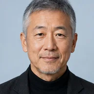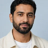






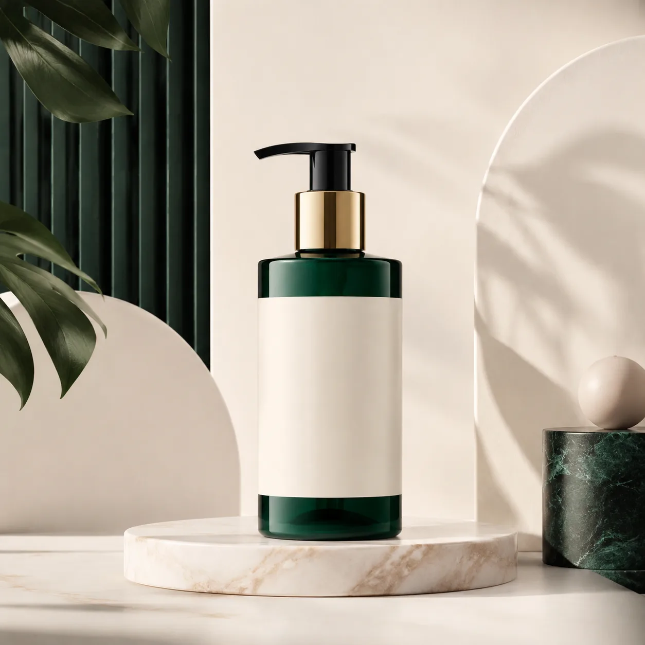
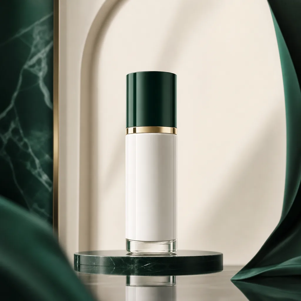
사례 1
품질 티어 컨트롤
간단한 제품 소스 이미지가 더 완성된 캠페인 에셋으로 변환됩니다.
GPT Image 2는 더 엄격한 품질 컨트롤, 더 풍부한 프롬프트 충실도 및 프로덕션 등급 이미지 출력으로의 더 신중한 경로를 원하는 사용자를 위한 모델 페이지입니다.
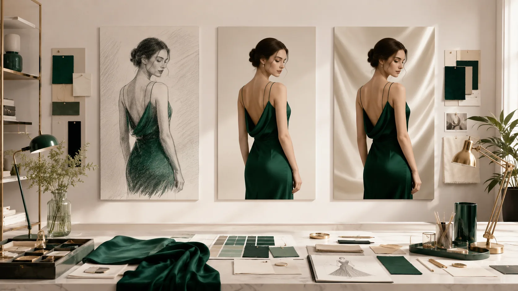
GPT Image 2로 초안, 균형 및 세련된 출력 경로를 비교하세요.
작업에 따라 표준, 중간 및 높은 품질 간에 전환하여 속도, 비용 및 출력 충실도의 균형을 맞추세요.
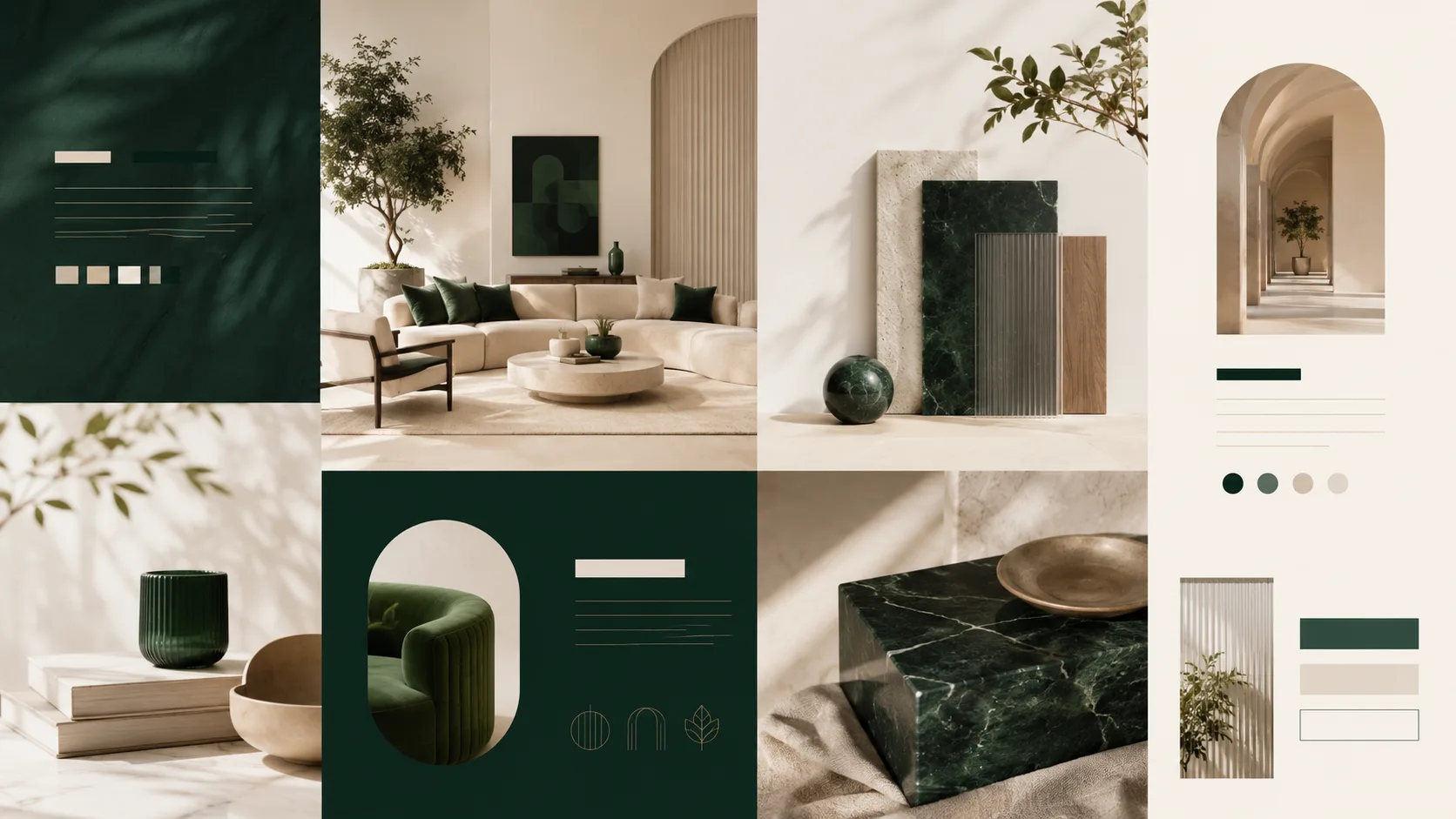
계층 구조, 디자인 구조 및 텍스트 배치가 중요할 때 GPT Image 2를 사용하세요.
계층화된 아트 디렉션, 제품 요구사항, 장면 설명 또는 미묘한 스타일 제약 조건이 있는 프롬프트에 적합합니다.
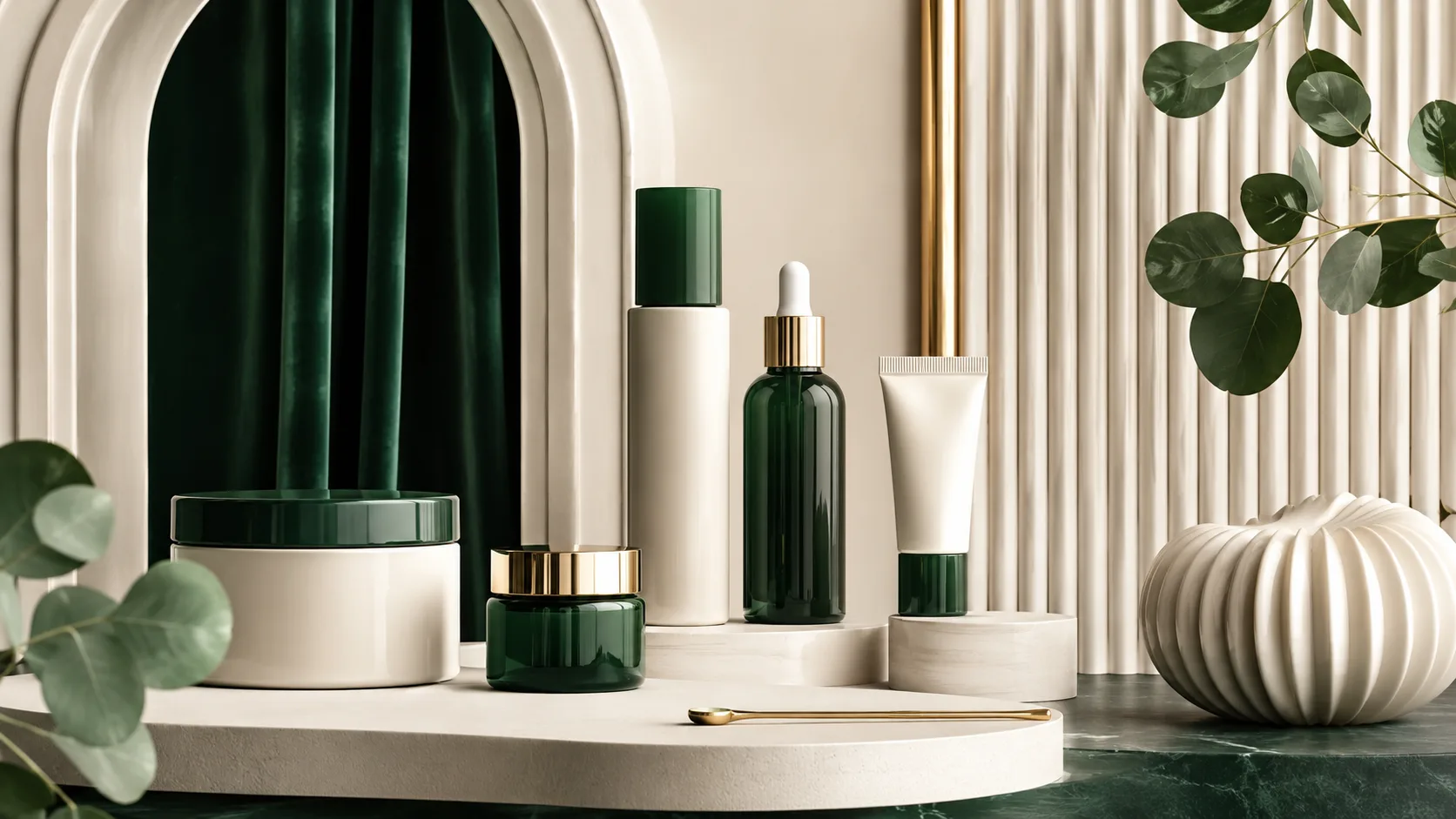
더 신중한 마감으로 세련된 브랜드 및 제품 비주얼을 만드세요.
프레젠테이션, 캠페인, 리스팅 및 세련된 크리에이티브 출력을 위해 더 선명하고 신중한 비주얼이 필요할 때 가장 좋은 선택입니다.
생성 사례
이 사례들은 GPT Image 2의 강점에 집중합니다: 다국어 타이포그래피, 만화 패널, 제품 그리드 및 완성된 캠페인 비주얼.
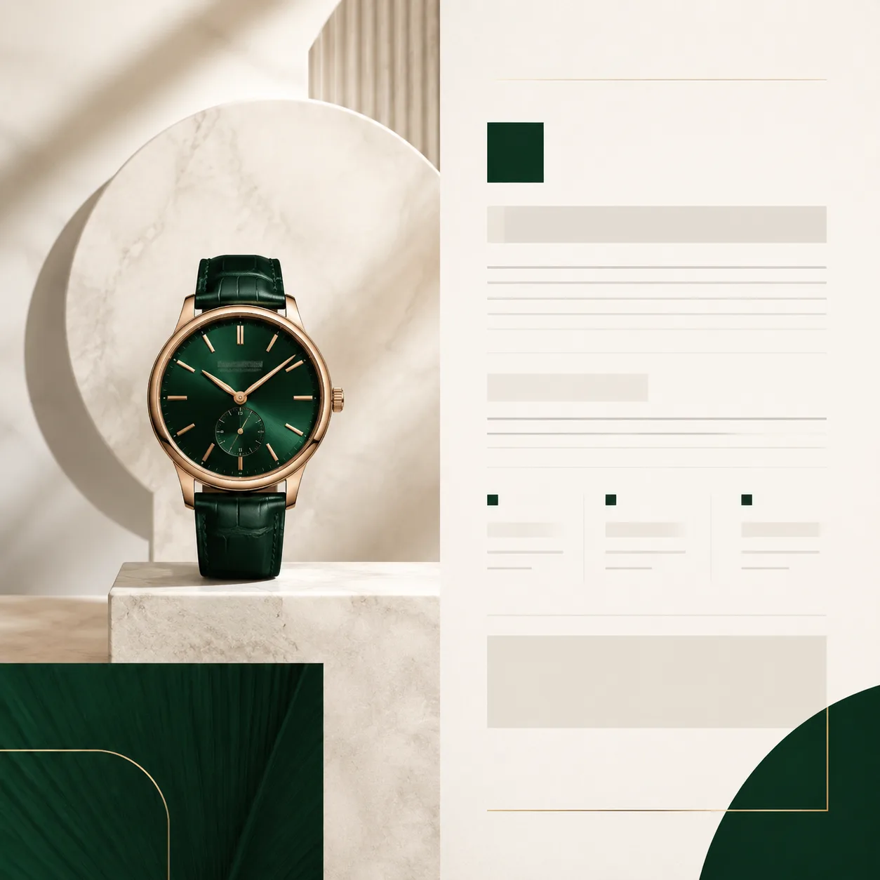
사례 1
간단한 제품 소스 이미지가 더 완성된 캠페인 에셋으로 변환됩니다.
사례 2
거친 포스터 컨셉이 더 명확한 에디토리얼 레이아웃으로 변환됩니다.
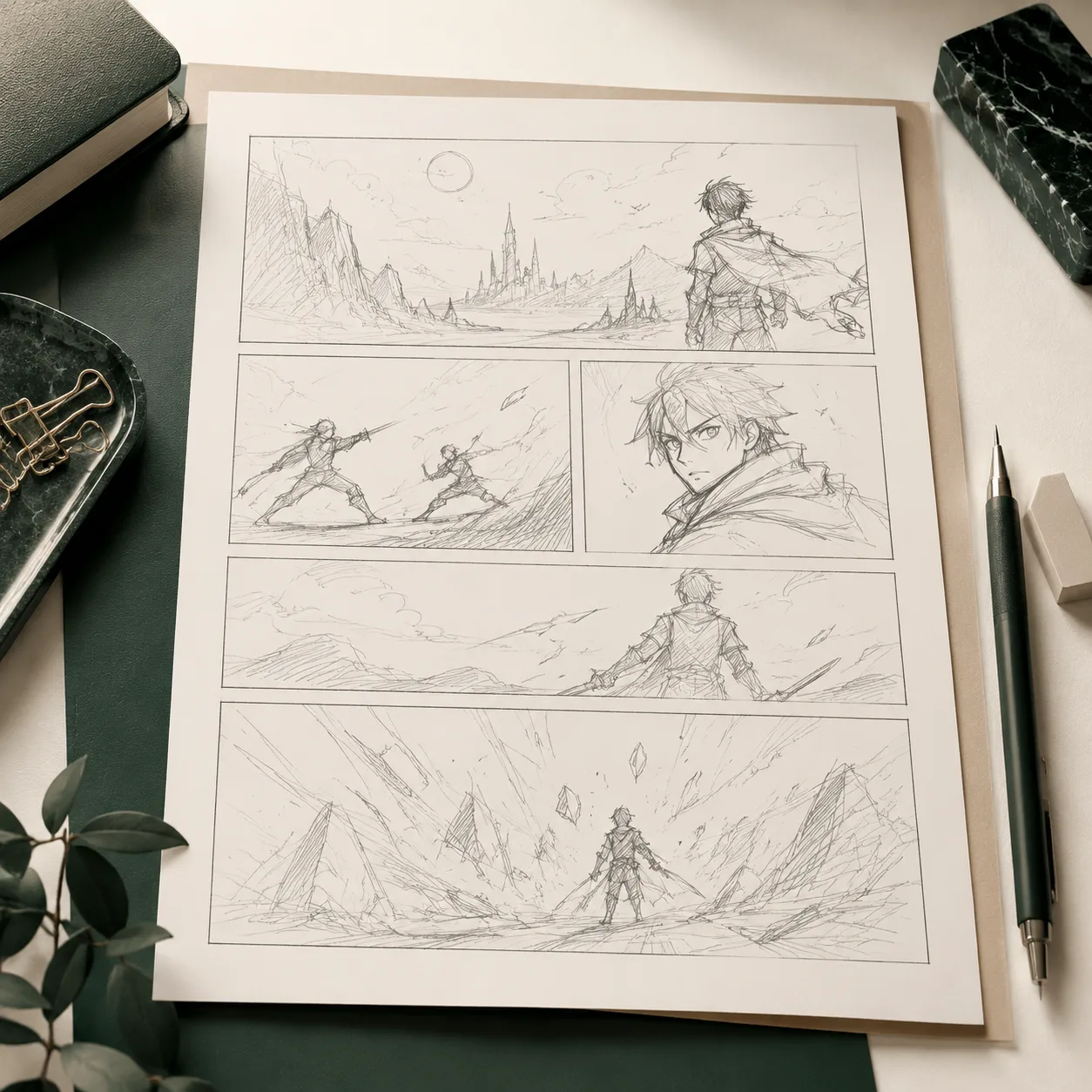
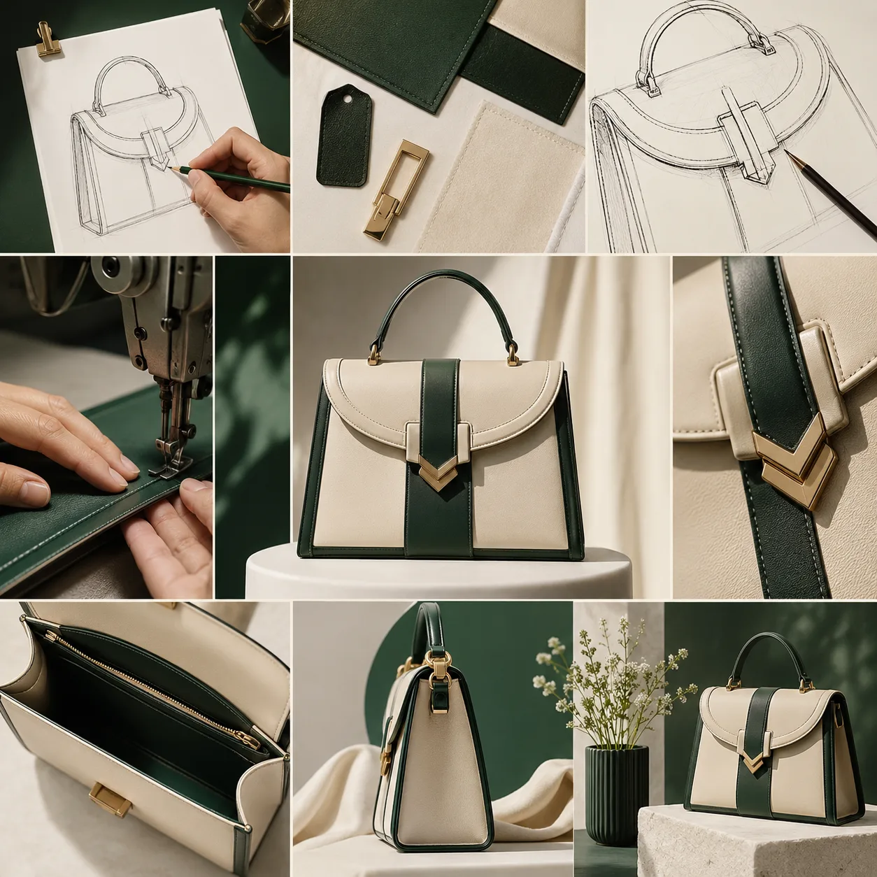
사례 3
거친 내러티브 스케치가 더 세련된 이미지 시퀀스로 변환됩니다.
모델 갤러리
이 페이지는 신중한 품질 티어, 상세한 프롬프트 응답 및 빠른 러프 탐색보다 상업용 렌더링을 통해 GPT Image 2를 설명합니다.
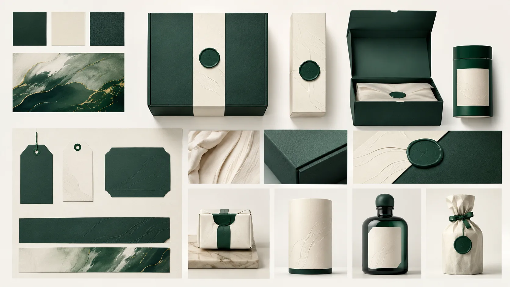
Packaging
1 / 5세련된 브랜드 작업을 위한 생성된 패키징 비주얼.
프롬프트 예시
이 모델의 실제 프롬프트 사례를 살펴보고, 사례를 열어 프롬프트를 복사하거나 생성기에서 재사용하세요.
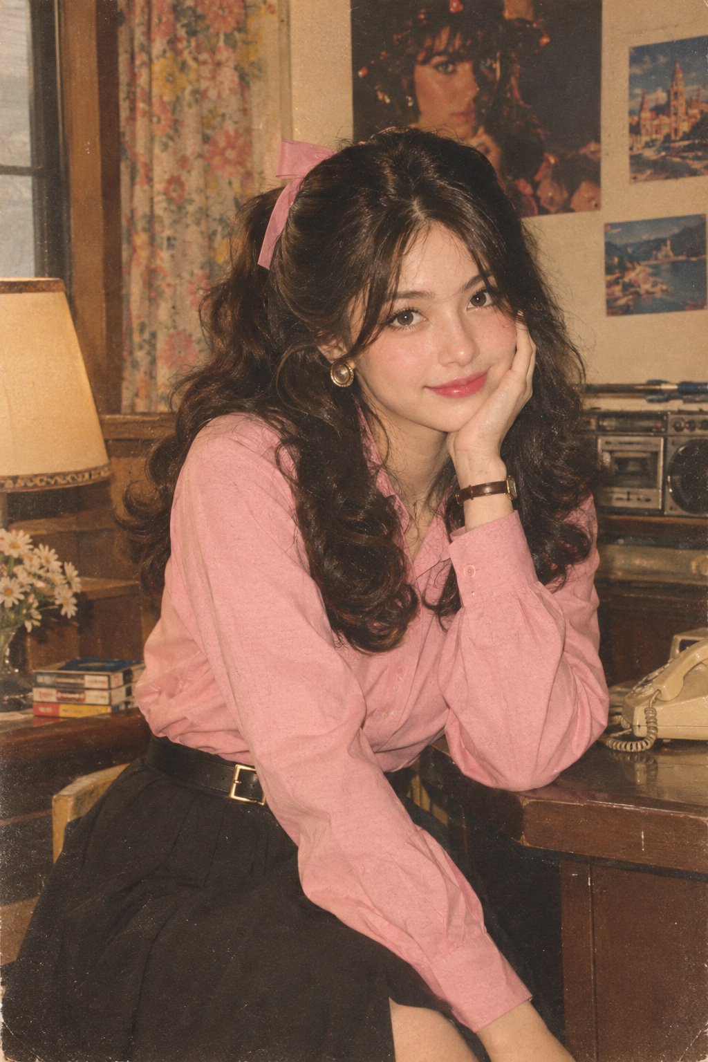
1980년대 인도 스타일 레트로 포토 촬영
Let’s join the trend 😀 Prompt: Transform my photo into an authentic 1980s retro Indian fashion portrait, inspired by the reference image. Keep the exact face, facial features, face structure, skin tone, identity, and natural proportions unchanged. Do not alter or beautify the face. Dress her in a full-sleeve pink shirt tucked neatly into a black high-waisted skirt with a stylish belt. Remove the scarf completely. Add simple 1980s-inspired accessories. Give her bouncy, voluminous retro hair styled with a cute ribbon. Create an authentic 1980s background and atmosphere. Use a Kodak film-camera look with warm faded colors, subtle film grain, soft analog texture, gentle vintage lighting, and natural skin texture. Make it look like a genuine photograph taken in the 1980s, not a modern photo with a vintage filter. No watermark, no text, no distortion.
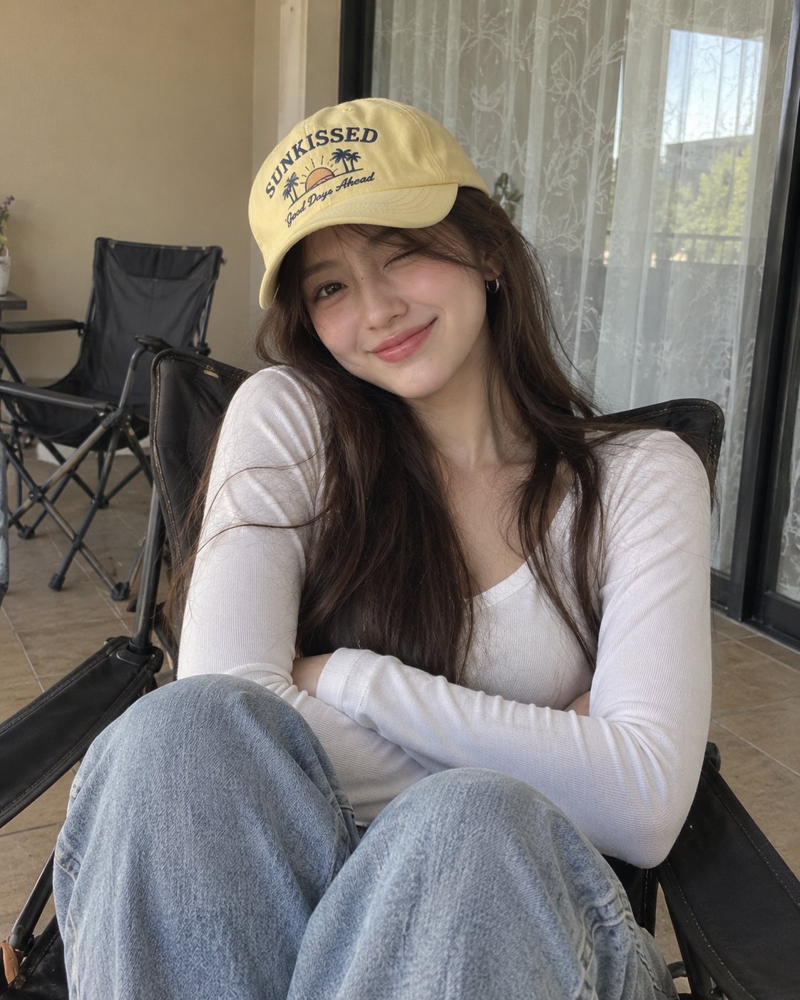
실내 캠에서 찍은 여성 포토샵 이미지
Crafted by GPT image 2 Prompt: Ultra-realistic casual portrait of a young woman sitting comfortably in a dark folding lounge chair, photographed indoors with a smartphone. She has long, straight dark-brown hair falling naturally over her shoulders, soft facial features, smooth natural skin, dark expressive eyes, and a warm playful smile with her eyes gently squinting. She wears small silver hoop earrings and a pale yellow baseball cap with a playful vintage graphic and lettering on the front. She is dressed in a simple fitted white long-sleeve V-neck top and light blue relaxed-fit jeans. Her arms are comfortably crossed over her torso, creating a relaxed and confident pose. She is seated with her knees slightly raised toward the camera. The setting is a cozy indoor balcony or casual room, with a beige wall, a large window covered by sheer patterned curtains, tiled floor, and dark folding chairs in the background. Soft natural daylight enters through the window, producing even illumination and gentle shadows. Authentic smartphone photography, candid lifestyle aesthetic, natural skin texture, realistic hair strands, detailed clothing fabric, subtle imperfections, soft neutral color palette, relaxed youthful mood, shallow depth of field, realistic proportions, photorealistic, high resolution, vertical 4:5 composition. Negative prompt: cartoon, anime, CGI, plastic skin, excessive makeup, distorted face, asymmetrical eyes, malformed hands, extra fingers, unnatural pose, unrealistic hair, blurry subject, oversaturated colors, warped background, excessive retouching, text artifacts, watermark.
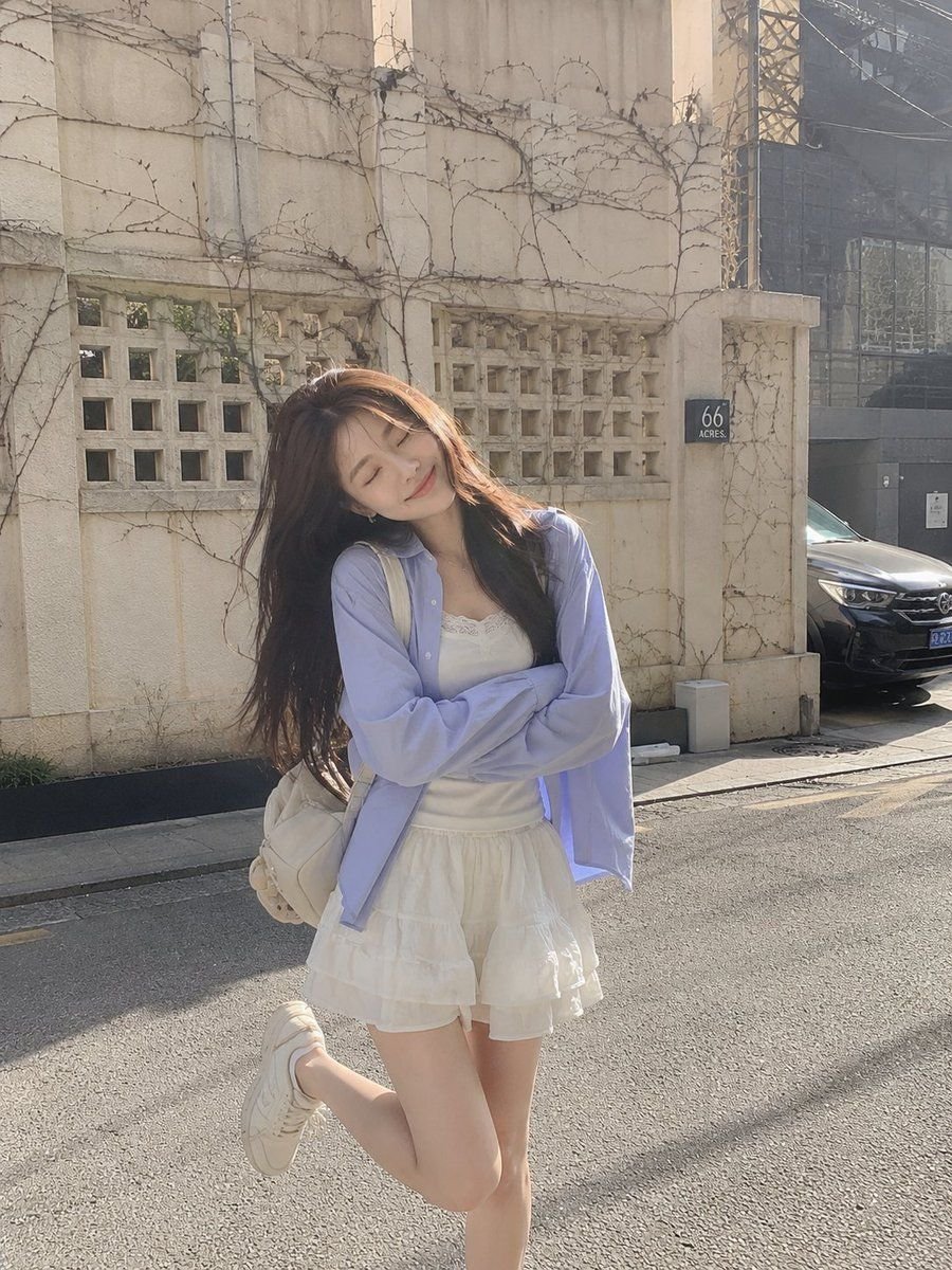
프리미엄 에디토리얼 아트 포스터: 원본과 변주의 조화
GPT image 2 on chatgpt Prompt Create a premium editorial art poster for every uploaded photograph, treating each image as its own independent composition and never merging multiple photos together. Use a strict 3:4 vertical format with the canvas split into two perfectly equal horizontal halves: the upper half should remain a faithful, photorealistic presentation of the original image, preserving the subject’s exact identity, facial features, proportions, pose, clothing, objects, composition, lighting, shadows, mood, and natural colors, enhanced only with sophisticated editorial color grading and seamless environmental extension where necessary; the lower half should transform the visual story into an entirely different artistic interpretation—a tiny, carefully composed handmade mixed-media artwork centered within expansive warm ivory negative space, occupying no more than 10–20% of the lower section, using expressive ink sketching, layered gouache-like color fields, subtle collage textures, torn-paper edges, imperfect brushwork, visible fibers, soft pigment variations, and charming human imperfections while retaining the most recognizable silhouette, gesture, objects, and emotional narrative from the original photo. Extract up to four dominant harmonious colors from each photograph and reinterpret them in a muted, sophisticated palette. Add only occasional understated editorial typography when it genuinely enhances the composition, such as a poetic title, place, date, or single word. The overall result should feel like a collectible contemporary art publication cover—minimal, poetic, tactile, elegant, emotionally quiet, visually distinctive, and unmistakably connected to its original photograph.
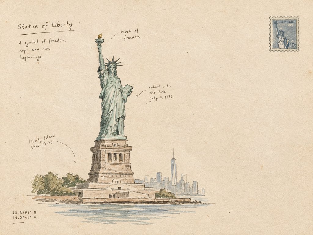
따뜻한 에이블 가면 위에 그려진 미니멀 건축 일러스트레이션
Create a minimal hand-drawn architectural artwork of [STRUCTURE] on warm ivory paper. Show the structure as a simple, elegant ink sketch with clean imperfect lines, subtle pencil shading, tiny handwritten annotations, and a few delicate architectural details. Keep the composition airy with plenty of blank space, muted earthy tones, soft paper texture, and an authentic handmade travel-journal feel. No photorealism, no heavy details, no clutter — simple, artistic, and refined.
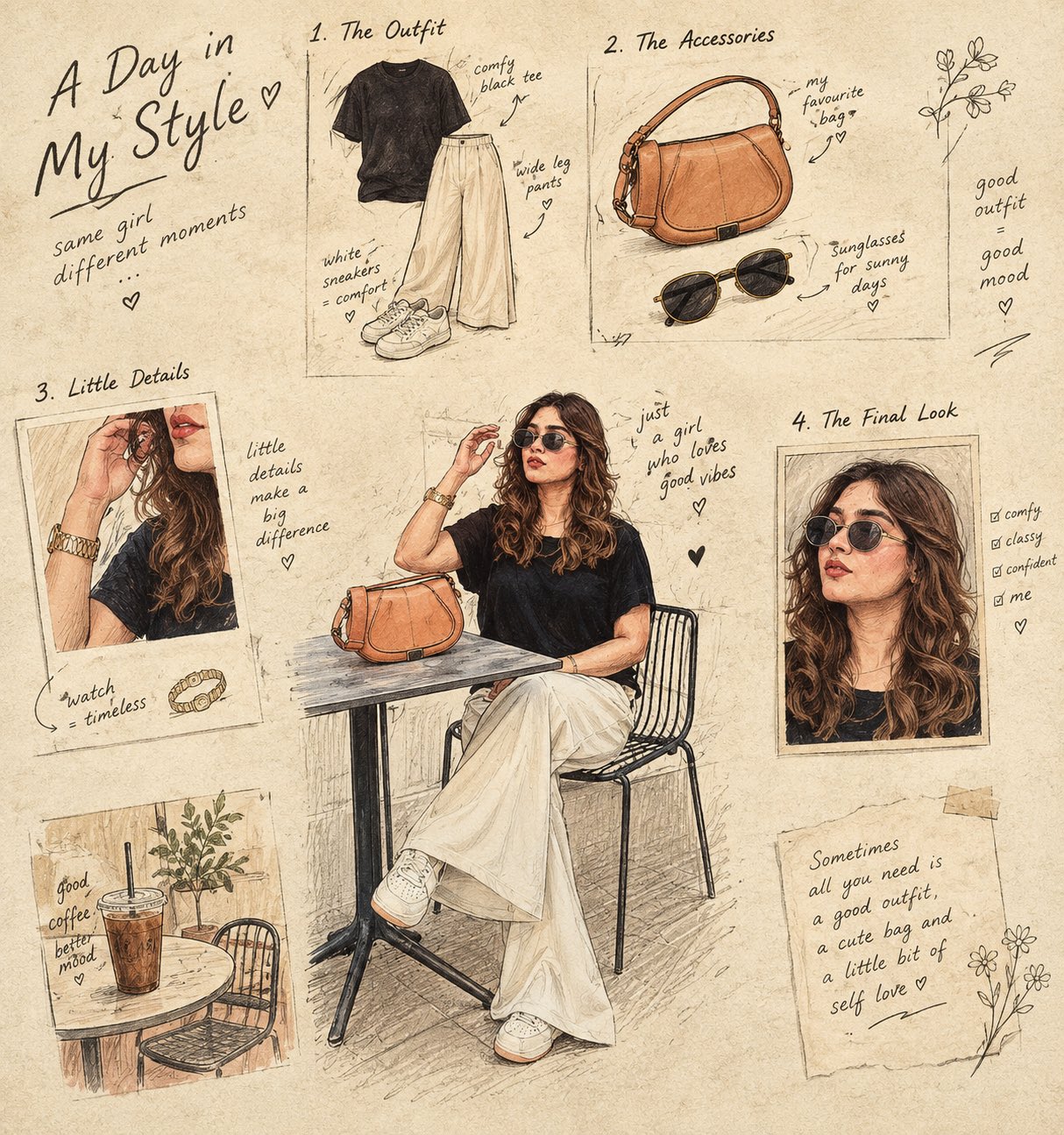
손그림 커피 만드는 과정 일화
Turn the main subject into a visual story told through 4–6 small illustrated frames. Keep the original object recognizable, but reinterpret it as a charming hand-drawn sequence showing its ingredients, preparation, texture, and final form. Use a warm cream paper background, delicate ink outlines, subtle handwritten annotations, tiny arrows, ingredient sketches, measurement marks, and imperfect print textures. The composition should feel like a page from an old culinary sketchbook — artistic, intelligent, nostalgic, and highly curated. Do not simply reproduce the photograph. Transform its subject into an illustrated visual narrative.
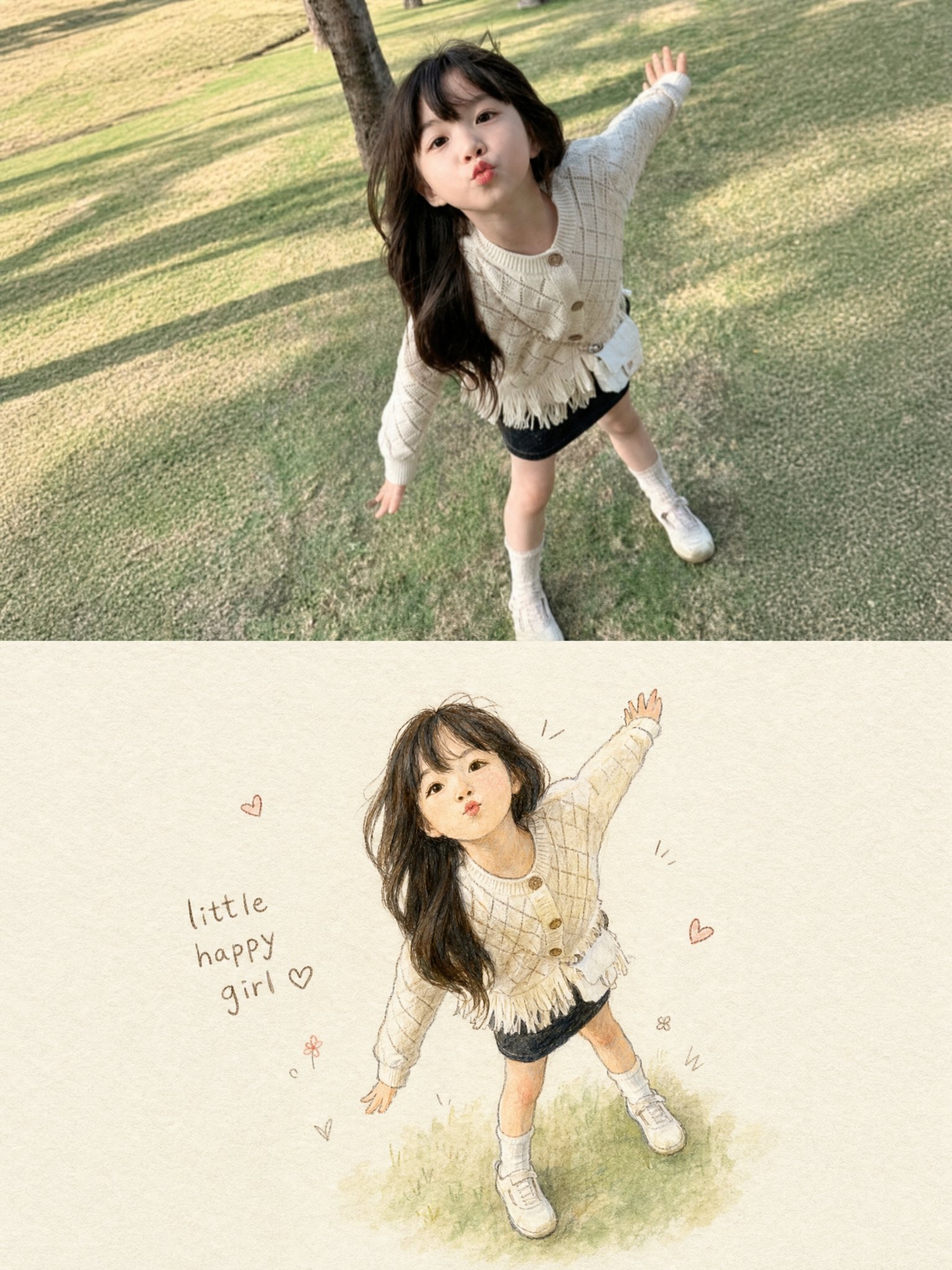
원본 사진을 기반으로 한 단일 세로 3:4 PHOTO + HAND-DRAWN ILLUSTRATION 예술 작품
Create a single vertical 3:4 PHOTO + HAND-DRAWN ILLUSTRATION artwork based ONLY on the uploaded photograph. Use the uploaded photograph as the ONLY visual reference. Analyze the photograph independently and reproduce the exact subject, pose, expression, clothing, hairstyle, accessories, objects, proportions, and overall moment in the illustration. Do not introduce elements from any previous image or reference. TOP — ORIGINAL PHOTOGRAPH Use approximately the upper 50% of the canvas for the original photograph. Preserve the photograph faithfully and naturally: - Keep the original subject exactly recognizable. - Preserve the face, expression, hairstyle, clothing, accessories, pose, body proportions, and visible objects. - Preserve the original environment and composition. - Do not retouch, beautify, replace, or redesign the subject. - Keep the photograph realistic with its original lighting, colors, textures, and details. BOTTOM — HAND-DRAWN ILLUSTRATION Use approximately the lower 50% for a charming handmade illustration of the SAME photograph. Transform the photographic moment into a delicate children's storybook-style hand-drawn artwork. Illustration style: - Soft watercolor and colored-pencil texture - Gentle pencil/ink outlines - Slightly imperfect handmade strokes - Warm, tactile off-white textured paper - Soft natural shading - Subtle watercolor washes - Cute, expressive, wholesome appearance - Delicate handcrafted imperfections - No glossy digital-rendered appearance - No photorealism - No 3D CGI - No anime or cartoon franchise style Most importantly, accurately preserve the subject from the photograph: - Same pose and body position - Same facial expression - Same hairstyle - Same clothing and clothing patterns - Same shoes/accessories - Same proportions - Same distinctive visual details - Same overall action or mood Simplify the background substantially. Do not recreate every background detail. Keep only a very subtle suggestion of the original environment, allowing the illustrated subject to remain the main focus. Place the illustrated subject slightly smaller than the photograph's subject, surrounded by generous negative space. MINIMAL DECORATIVE DETAILS Add a few tiny hand-drawn decorative marks around the illustration, such as: - small hearts - simple motion lines - tiny doodles - subtle stars or flowers Keep these decorations sparse and tasteful. Add a small handwritten caption near the illustration, such as: "little happy girl ♡" The caption should look naturally handwritten with a casual brown/gray pencil or ink texture. If the uploaded subject is not a girl, automatically adapt the wording appropriately or omit the caption entirely. OVERALL AESTHETIC The final artwork should feel like a precious memory transformed into a page from a handmade children's picture book. Composition: - Vertical 3:4 - Clean separation between photograph and illustration - Soft warm editorial presentation - Large amount of negative space around the illustration - Minimal, elegant, sentimental - Premium handmade stationery / illustrated scrapbook aesthetic CRITICAL RULE: The uploaded photograph is the sole source of truth. Do not invent, substitute, merge, or carry over any person, clothing, object, background element, color, pose, or detail from another image. The bottom illustration must clearly look like a hand-drawn version of the EXACT moment shown in the top photograph. REFERENCE PRIORITY: 1. Exact subject and pose 2. Facial expression and hairstyle 3. Clothing and accessories 4. Overall composition 5. Illustration style 6. Minimal decorative elements Never sacrifice subject accuracy for artistic stylization.#Lovart #LovartPartner
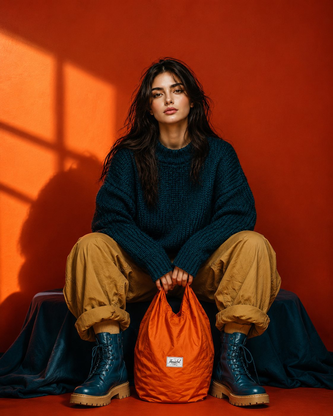
우리드라마틱한 색채의 패션 포토샵 에디토리얼
Ultra-realistic full-body editorial fashion portrait of a beautiful young woman sitting low in a relaxed wide-leg pose, knees raised and slightly apart, both hands naturally holding the handles of a bright orange nylon tote bag positioned between her feet. Keep her facial identity and facial proportions exactly consistent with the reference image, long slightly messy dark-brown hair, natural skin texture, minimal makeup, calm confident expression, no glasses. She wears an oversized chunky deep-teal knitted sweater, loose camel/tan cargo pants with casually rolled cuffs, and chunky dark-teal lace-up combat boots with warm tan soles. Bold burnt-orange studio background with dramatic golden sunlight creating geometric window shadows across the wall. Strong teal, orange and camel color blocking, rich saturated colors, stylish but not overly glamorous. Centered symmetrical composition, slightly low camera angle, full body completely visible, relaxed editorial posture, realistic fabric textures, subtle imperfections, cinematic directional lighting, crisp details, premium contemporary fashion campaign photography, natural proportions, photorealistic, 9:16 vertical.
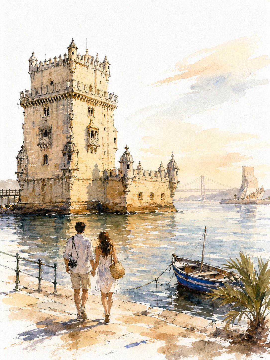
엔폴리드 빌딩 일상 여행 스케치 일러스트레이션
A loose, unfinished watercolor-and-ink travel sketch of New York: fast broken line, uneven washes, generous bare paper, golden-hour light. SUBJECT Hero: the Empire State Building from street level, frontal and slightly upward-tilted, full height inside the frame, 68–75% of poster height, anchored on the right third, base in the lower-middle third. Behind it: the Chrysler crown, small and low left, plus 2–3 soft masses standing in for Midtown. Nothing else — no Liberty, no Brooklyn Bridge, no Times Square. Bright white cold-press paper, no cream or sepia cast. IDENTITY LOCK — the only sustained drawing in the image (a) stepped Art Deco setbacks narrowing in stages toward the top (b) continuous vertical piers with recessed window bands — long strokes, never individual windows (c) the tiered crown lantern with mooring mast and antenna These carry the strongest contrast, are never cropped, never fade to blank paper. COUPLE A young couple seen from behind, arms linked, walking up the avenue, one glancing up at the tower. 14–18% of poster height, in the bottom 22–25% band. Mid-century-cut travel coats; a small handbag, a compact suitcase. 10–15 strokes each — silhouette, hair mass, coat line, legs. No faces, no fingers, no folds, no third figure. The most resolved human element in the image. LINE Contours break, skip, overshoot corners, and stop before meeting; weight varies within a single edge. Background architecture is gestural only — a roofline, a corner, an implied vertical. If a building reads in 5–8 strokes, stop at 8. Never window-by-window, never brick. Some forms exist as wash alone, no line. WATERCOLOR Never fill evenly. Within one surface the wash swings from deep pooled pigment on one side to bare paper on the other. Blooms and backruns with cauliflower edges, wet-in-wet bleed, hard pooled edges beside dissolved ones, dry-brush skips, granulation in the grain. Washes overshoot the ink by 5–10% in places and fall short elsewhere. No object is uniformly colored. Coverage 55–65%: leave bare paper across most of the sky, the distant city, sunlit faces, the outer 10–15% of the frame, and gaps in the pavement. Bare shapes are brush-formed and irregular, never rectangular. VALUE 6–10 fingernail-sized darks in burnt umber or dark indigo — setback shadows, window bands, under the awning, beneath the taxi and the couple, tower base. Drop them into damp wash so they bloom. Without these the image is a flat pastel smear. DEPTH Foreground strongest pigment and clearest line; distance at 15–25% pigment in dusty blue-gray and hazy peach with almost no line, grouped into 2–3 masses. LIGHT & COLOR Golden hour, light raking from the left so the tower has a lit face and a shaded face. Sky: 3–5 broad strokes, the rest bare paper, no detailed clouds. Warm limestone cream, pale apricot, warm gray, dusty steel blue, soft graphite. One saturated accent: taxi yellow. Props, 3 only — a yellow cab from behind, a lamp post, a striped awning edge. TEXT None anywhere: no title, caption, signage, storefront name, street sign, number, logo, or pseudo-lettering. Signs become abstract shapes. The top 15–18% stays clean and empty for titling added later. AVOID Photorealism, CGI, 3D render, generic AI architecture, hybrid or duplicated towers, extra setbacks, warped façade, repeating-window artifacts, mechanically even line weight, floating objects, roads into walls, inconsistent scale, visible faces, extra figures, flat even fills, uniform contrast at all distances, edge-to-edge painting, neon color, garbled text. Bare paper beats invented detail — everywhere except the identity features. RECOGNITION FIRST, VALUE SECOND, ATMOSPHERE THIRD, DETAIL LAST.
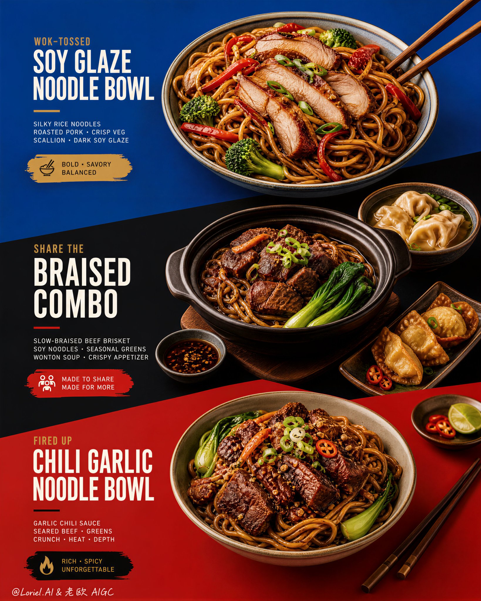
세로로 쌓인 컬러-블록 메뉴 포스터 디자인
This kind of menu poster works only when the color blocks do real layout work. Blue, black, and red should not be background decoration. They need to act like three stages, each one holding a different offer and pushing the eye downward through the poster. 🔷 three stacked color fields with strong diagonal transitions guiding the viewer from dish to dish This gives the menu a clear scan path. You see the top bowl first, then the sharing combo, then the richer bottom bowl, without the layout turning into a crowded food collage. 🥢 food placement and chopstick angles echoing the diagonal color-block geometry This makes the food feel designed into the poster. The bowls, side dishes, and utensils reinforce the same direction as the graphic cuts, so everything feels intentional instead of randomly placed. GPT- image 2 prompt👇 Create an ultra-premium restaurant advertising poster that merges Orbit-style compositional force with Transit-style international polish, preserving the exact structural logic of a bold color-block menu poster while refining it into a cleaner, sharper, more globally premium flagship campaign. Use a tall vertical layout divided into three large graphic color fields with strong angled transitions, where each color block acts as a compositional stage for a specific hero dish or combo. The final artwork must feel bold, graphic, craveable, modern, and Cannes-level commercial, with the food and color planes fused into one precise design system. Do not copy any original text, logo, pricing, or wording. Core composition: Use a vertical poster layout with three major stacked sections connected by strong diagonal or slanted color-block cuts. Top section: a premium blue field featuring one hero stir-fried rice noodle bowl. Middle section: a deep black-charcoal field featuring one larger family combo or shared meal composition. Bottom section: a rich red or terracotta-red field featuring a second hero noodle bowl. The transitions between color fields must feel sharper, more directional, and more deliberate, so the eye travels through the poster in one continuous graphic rhythm. Orbit enhancement: Push the structural energy of the color blocks much harder. The diagonal cuts between blue, black, and red should feel more assertive, almost slicing through the page and directing the viewer’s attention from top hero bowl, through the middle combo, into the lower bowl. The placement of bowls, chopsticks, and side dishes should echo these diagonal vectors, so the food itself appears orchestrated by the color geometry. The poster should feel more immediate and more visually aggressive from a distance. Transit enhancement: Refine the entire poster into an international flagship restaurant-advertising language. Use purer, more controlled color fields, cleaner typography spacing, calmer negative space, and more elegant hierarchy. The blue should feel fresher and more premium, the black deeper and more sophisticated, and the red more refined and less noisy. The result should feel like a global fast-casual or modern Asian dining brand campaign rather than a crowded local promo poster. Food and color-block integration: This is the most important feature. The dishes must feel inseparable from the color fields. Each bowl must sit in its section with exact compositional intention, using plate placement, garnish direction, chopstick angle, and nearby side elements to reinforce the graphic planes. The color blocks should not be passive backgrounds; they must actively frame, support, and sharpen the food presentation. Top hero bowl: Show a premium soy-glazed or stir-fried rice noodle bowl with glossy noodles, sliced roasted pork or chicken, red pepper strips, broccoli, scallions, and rich dark sauce sheen. The bowl should feel fresh, balanced, and immediately appetizing against the vivid blue field. Middle combo section: Show a richer, more abundant combo arrangement in the black-charcoal section: one deep bowl or clay pot with braised meat and noodles, plus one or two supporting side dishes such as soup, dipping bowl, or appetizer plate. The composition should feel generous but controlled, like a hero combo set for sharing. The darker section should make the warm food highlights glow more dramatically. Bottom hero bowl: Show a second noodle variation with deeper glaze, richer meat topping, greens, scallions, and carefully layered garnish. This lower bowl should feel slightly heavier and more indulgent, anchored powerfully against the red field. Typography system: Use bold, modern, highly legible menu typography integrated precisely into each section. Main dish names should be large, confident, and clean. Price blocks should sit inside compact contrasting graphic capsules or bold painted labels. Supporting copy must be short, sharp, and minimal. All wording must be fully original and fictional. Typography must align with the color-block structure and never float loosely. Lighting: Use bright premium food-commercial lighting with warm directional clarity and controlled highlights. The noodles must show moist elasticity, the meat should catch caramelized gloss, and vegetables should remain fresh and crisp. Keep the lighting polished and appetizing, but clean enough that the graphic composition remains dominant. Material rendering: Render noodles with springy tension and sauce sheen, meats with rich caramelized texture, vegetables with natural freshness, eggs or tofu if included with convincing surface detail, ceramic bowls with subtle glaze reflections, and chopsticks with elegant wood texture. The color fields should feel matte, flat, and graphically strong, contrasting with the realism of the food. Background and cleanliness: Keep the entire poster highly controlled and clean. No unnecessary pattern overload, no cluttered prop styling, no random elements outside the color-block logic. The graphic planes and food should carry the entire story. Color system: Use a disciplined premium palette of saturated but controlled blue, deep black-charcoal, refined terracotta-red, noodle gold, roast mahogany, scallion green, citrus green accents, and small off-white typography. The color blocks must feel bolder and more premium, while the warm food tones unify the poster. Image finish: The final poster must feel like a world-class flagship restaurant campaign: bold, directional, graphic, product-led, internationally polished, and instantly memorable. Preserve sharp food detail, precise color-block edges, elegant typography hierarchy, and immaculate commercial retouching. 8k, premium restaurant advertising quality. Negative prompt: copied text, copied pricing, copied logo, cluttered layout, weak color blocks, muddy food texture, limp noodles, greasy mess, random props, poor typography hierarchy, dirty background, black blotches, low-resolution food detail
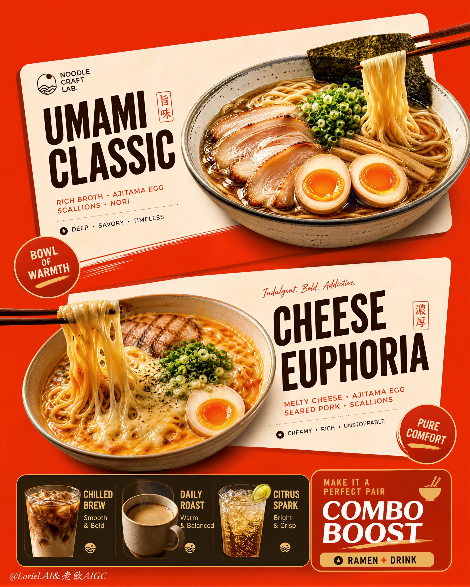
오리트-스타일과-트랜스잭트-스타일 결합 레스토랑 포스터 디자인
This poster works because the menu is built as cards, not as scattered food and text. The angled cream blocks do the organizing: each ramen gets its own stage, while the bottom strip handles add-ons without stealing attention from the two hero bowls. 🍜 two large cream-toned angled menu cards floating over a saturated orange-red background This creates instant hierarchy. You see offer one, offer two, then the supporting combo strip, because the cards separate the information before the text even matters. 🥢 bowls, chopsticks, badges, and typography aligned to the same slanted card geometry This keeps the density clean. The food, labels, and graphic shapes all lean in the same direction, so the poster feels energetic without becoming messy. GPT- image 2 prompt👇 Create an ultra-premium vertical restaurant advertising poster that merges Orbit-style compositional force with Transit-style international polish, preserving the exact logic of a bold ramen combo menu while refining it into a cleaner, sharper, more globally premium flagship campaign. Use one dominant saturated orange-red background field and build the poster around two large cream-toned angled menu-card blocks floating through the center, each framing one ramen hero dish, with a compact drink-combo strip anchored along the bottom. The final image must feel graphic, hot, craveable, modern, and commercially irresistible, with the food and color-block geometry fused into one exact system. Do not copy any original text, logo, price, or wording. Core composition: Use a strict vertical poster architecture with three main beats: 1. a bold upper hero card featuring one ramen bowl, 2. a second slightly offset lower hero card featuring another ramen bowl, 3. a compact bottom combo strip featuring three drinks and one combo-offer zone. The orange-red field must act as the dominant visual stage, while the cream menu-card blocks slice across it with more deliberate angled placement. The whole poster must read instantly as a strong graphic food composition. Orbit enhancement: Push the card geometry harder. The two large cream cards should feel more decisively slanted and more dynamically offset, as if they are thrusting the food forward through the page. The bowls, price badges, and chopstick directions should align with these card angles so the entire poster feels driven by one aggressive compositional motion. The upper and lower ramen heroes should feel like two strong visual hits in a diagonal rhythm. Transit enhancement: Refine the whole image into a more international flagship restaurant-advertising language. Make the orange-red field cleaner and more premium, the cream cards softer and more elegant, the typography more disciplined, and the supporting elements more restrained. Reduce unnecessary icon clutter and decorative noise. The result should feel like a global fast-casual or modern Asian dining brand campaign with polished international art direction. Upper ramen hero: Show one premium ajitsuke tamago-style ramen bowl with rich glossy broth, springy noodles, a halved jammy egg, chopped scallions, and dark nori. The bowl should feel warm, comforting, and immediately craveable. Place it confidently within the upper cream card so the bowl, title zone, and price badge feel locked together. Lower ramen hero: Show one indulgent cheese-and-egg ramen variation with melted cheese stretching from lifted noodles, glossy broth, sliced meat or chashu, chopped scallions, and halved egg. The cheese pull should be clean, appetizing, and visually dramatic. Place the bowl so it balances the lower card while still feeling contained by its geometry. Drink combo strip: At the bottom, include a narrow premium combo strip with three compact drink modules: - iced coffee, - hot coffee, - cold soda or sparkling drink. These should feel like clean supporting products, each inside simple rounded or capsule-like graphic areas. Add one strong combo-value block to anchor the strip, but keep the entire bottom section tight, clean, and secondary to the two ramen heroes. Typography system: Use bold modern display typography with strong hierarchy and clean scanning logic. Dish names should be large and high-contrast. Price elements should sit in compact circular or capsule badges. Supporting lines should be short and minimal. All wording must be fully original and fictional. The typography must align tightly with the cream card structures and feel globally polished. Color-block integration: This is the most important feature. The food must feel inseparable from the color blocks. The orange-red background and cream cards must not behave like passive backgrounds; they must actively shape the poster, frame the dishes, direct the eye, and create rhythm. Bowls, chopsticks, price tags, and text must all appear intentionally positioned according to the card angles and color boundaries. Lighting: Use bright premium food-commercial lighting with warm directional clarity. Broths must glow with rich sheen, noodles must feel elastic, eggs must show soft yolk richness, and cheese must feel molten and luxurious. The drinks should show clean reflections and believable temperature cues. Keep lighting appetizing but controlled so the graphic structure remains dominant. Material rendering: Render ceramic bowls with subtle glaze reflections, broths with translucent depth, noodles with moist sheen, meats with caramelized texture, cheese with smooth melt physics, eggs with creamy yolks, and drinks with realistic ice, crema, or bubbles. The cream cards should feel matte and graphic, contrasting with the realism of the food. Background and cleanliness: Keep the poster tightly controlled and free of clutter. If any subtle texture appears in the orange-red field, keep it minimal and premium. Avoid unnecessary environmental storytelling. This must remain a graphic menu-poster composition first. Color system: Use a disciplined premium restaurant palette of orange-red, cream, warm beige, deep brown, black, noodle gold, broth mahogany, egg orange, scallion green, and coffee tones. The overall effect should be vivid, hot, and globally polished. Image finish: The final poster must feel like a world-class flagship ramen combo campaign: bold, graphic, product-led, appetizing, and commercially exact. Preserve sharp food detail, strong card geometry, clear typographic hierarchy, and immaculate commercial retouching. 8k, premium restaurant advertising quality. Negative prompt: copied brand names, copied pricing, copied slogan, cluttered menu text, weak card angles, weak color-block structure, muddy broth, limp noodles, fake cheese pull, greasy mess, random props, poor hierarchy, dirty background, black blotches, low-resolution food detail
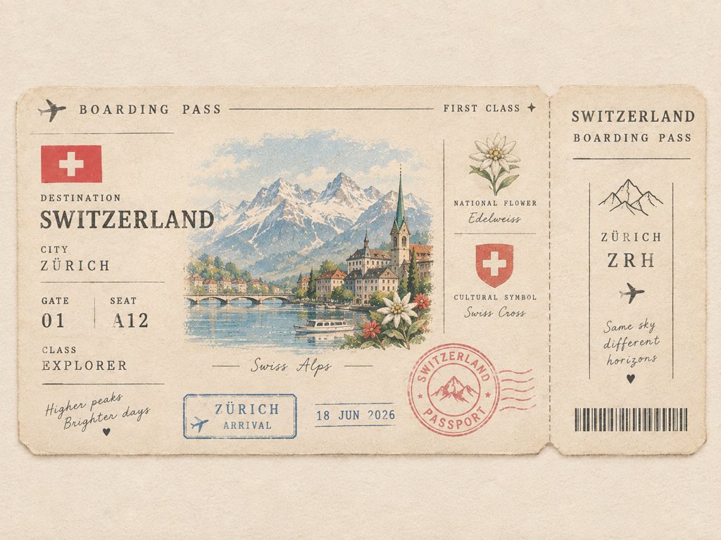
캐치한국명소 미니 패스포트 게이팅 아이콘 일러스트레이션
Create a cute minimalist vintage passport boarding pass for [COUNTRY]. Feature a tiny illustrated iconic landmark as the main detail, with a miniature country flag, local flower, cultural symbol, destination code, passport stamp, date stamp, and tiny ticket details. Use warm ivory paper, soft muted pastel colors, thin vintage borders, subtle paper fibers, slightly faded ink, delicate typography, and lots of clean negative space. Make it look like a collectible passport keepsake from a charming journey — elegant, tiny, nostalgic, playful, and premium. Front-facing flat composition, balanced layout, no clutter, no collage, no photorealism. Ticket details can include: * DESTINATION: [COUNTRY] * CITY: [FAMOUS CITY] * GATE: [01] * SEAT: [A12] * CLASS: EXPLORER * STAMP: [COUNTRY] PASSPORT * DATE: 2026 * LANDMARK: [ICONIC LANDMARK]
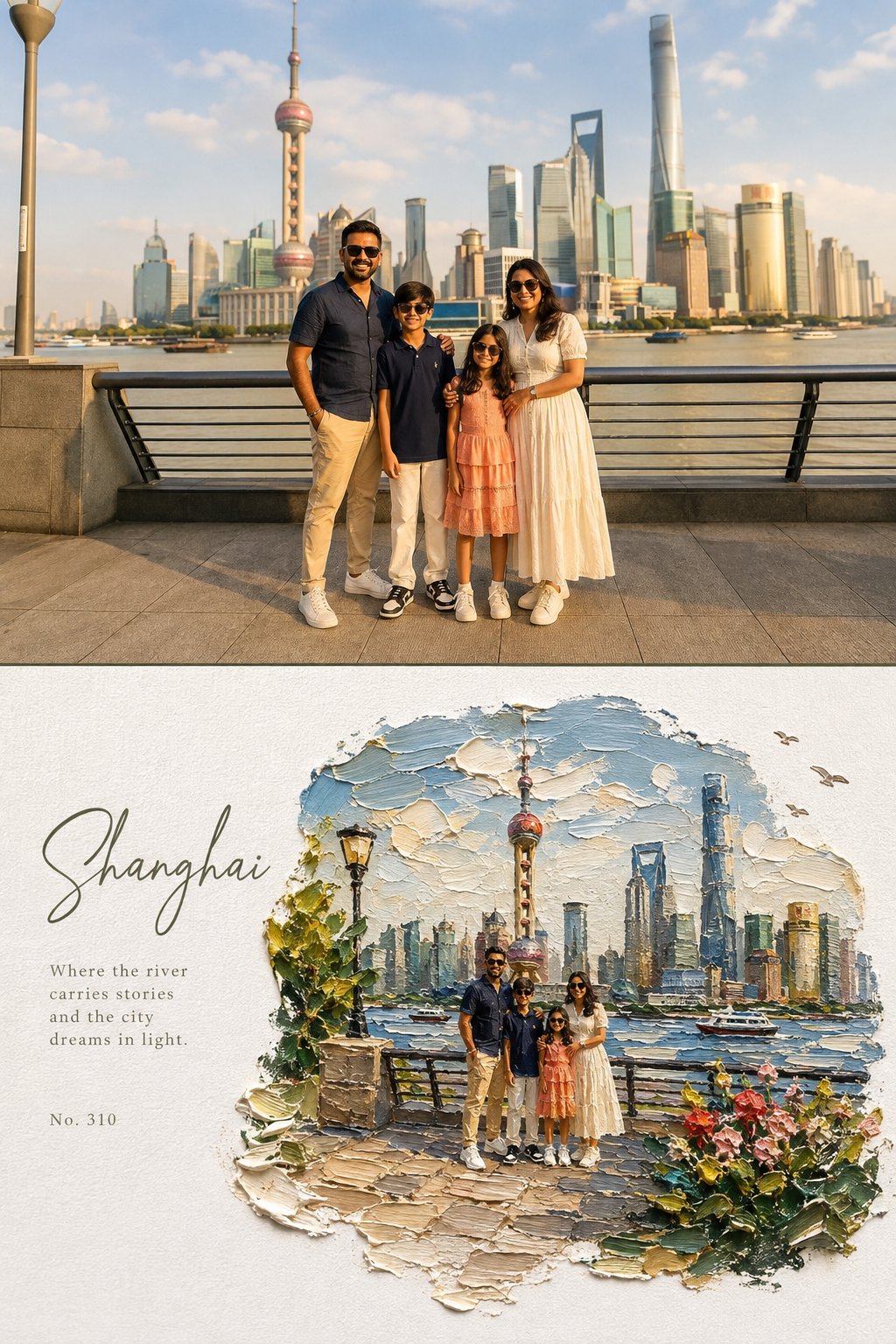
원본 사진과 임파스토 미니어처 세계를 3대4 세로 포스터로 결합한 에디토얼 아트 프롬프트
Create a high-end editorial art poster in strict 3:4 vertical format, divided horizontally into two equal 50% halves, with either a seamless join or a very thin divider. TOP — ORIGINAL PHOTO Preserve the photograph exactly: identity, faces, clothing, proportions, poses, expressions, and subject relationships must remain unchanged. Apply only a warm fine-art film grade with soft contrast, lifted shadows, warm highlights, natural vivid color, and subtle grain. Extend the background naturally if needed, without distorting subjects. Generous environmental space is encouraged. BOTTOM — IMPASTO MINIATURE WORLD Reimagine the same scene as a poetic miniature diorama made from extremely thick impasto oil paint on pure white textured paper. Keep subjects recognizable but make them tiny, figurine-like, preserving their poses, clothing colors, and key features. The painted world should occupy 60–75% of the lower half, surrounded by generous white negative space. Use organic, irregular, feathered paint edges, never a rectangular frame. Include sculptural palette-knife clouds, reflective water or a natural path, small flowers, grass, foliage, rocks, birds, distant scenery, and atmospheric light where appropriate. The environment may become slightly more idyllic and dreamlike. Make the paint thick, tactile, raised, and three-dimensional, with visible brush and palette-knife marks, paint ridges, drag textures, tiny shadows, and subtle translucent glazes. Keep the paper grain clearly visible. TYPOGRAPHY Place elegant typography only in the white space: a large handwritten calligraphy title, a short poetic subtitle, and a small reference number. Use refined olive green, warm gray, or soft blue-gray tones. Keep typography understated. COLOR & MOOD Use vivid, natural colors inspired by the photograph: sky blue, lake blue, green, warm yellow, coral, cherry red, peach, cream, and warm white. The overall feeling should be sunny, fresh, warm, joyful, relaxed, and dreamlike. Avoid: muted or muddy colors, sepia, dark-brown filters, fluorescent tones, flat digital art, smooth airbrush effects, plastic 3D rendering, hard borders, generic fonts, text over subjects, and distorted figures.
OpenAI 쇼케이스 신호
강조 표시된 예시는 OpenAI 쇼케이스 자료를 타이포그래피, 레이아웃, 스토리 및 세련된 브랜드 출력을 위한 프롬프트 경로로 변환합니다.
OpenAI 경로
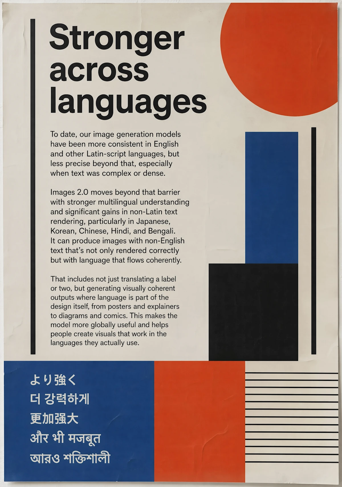
OpenAI는 더 강력한 다국어 렌더링 및 글로벌 스크립트에 관한 포스터를 포함한 여러 타이포그래피 중심 예시를 제시하며, 이는 브랜드 및 에디토리얼 작업에 유용한 패턴입니다.
디자인 프롬프트
더 강력한 다국어 이미지 생성에 관한 대담한 에디토리얼 포스터를 만들고, 기하학적 빨간색, 파란색, 검은색 및 크림색 모양, 읽기 가능한 카피 블록 및 여러 글로벌 스크립트를 사용하세요.
GPT Image 운영 노트
에셋 유형, 레이아웃, 텍스트 배치, 마감 수준 및 품질 대상을 일찍 설명하여 모델이 이미지를 디자인된 산출물로 추론할 수 있도록 하세요.
GPT Image 2는 최종 이미지에 강력한 마감, 구조화된 추론, 타이포그래피 및 상업적 폴리쉬가 필요할 때 사용하는 모델 페이지입니다. OpenAI의 공식 ChatGPT Images 2.0 쇼케이스에는 에디토리얼 포스터, 다국어 타입 시스템, 만화 및 만화 페이지, 학술 포스터, 제품 그리드 레이아웃, 환대 캠페인 자산, 패션 북 스프레드, 푸드 기반 브랜드 구성, 도시 장면, 인쇄 가이드가 있는 북마크 및 교육 인포그래픽이 포함됩니다.
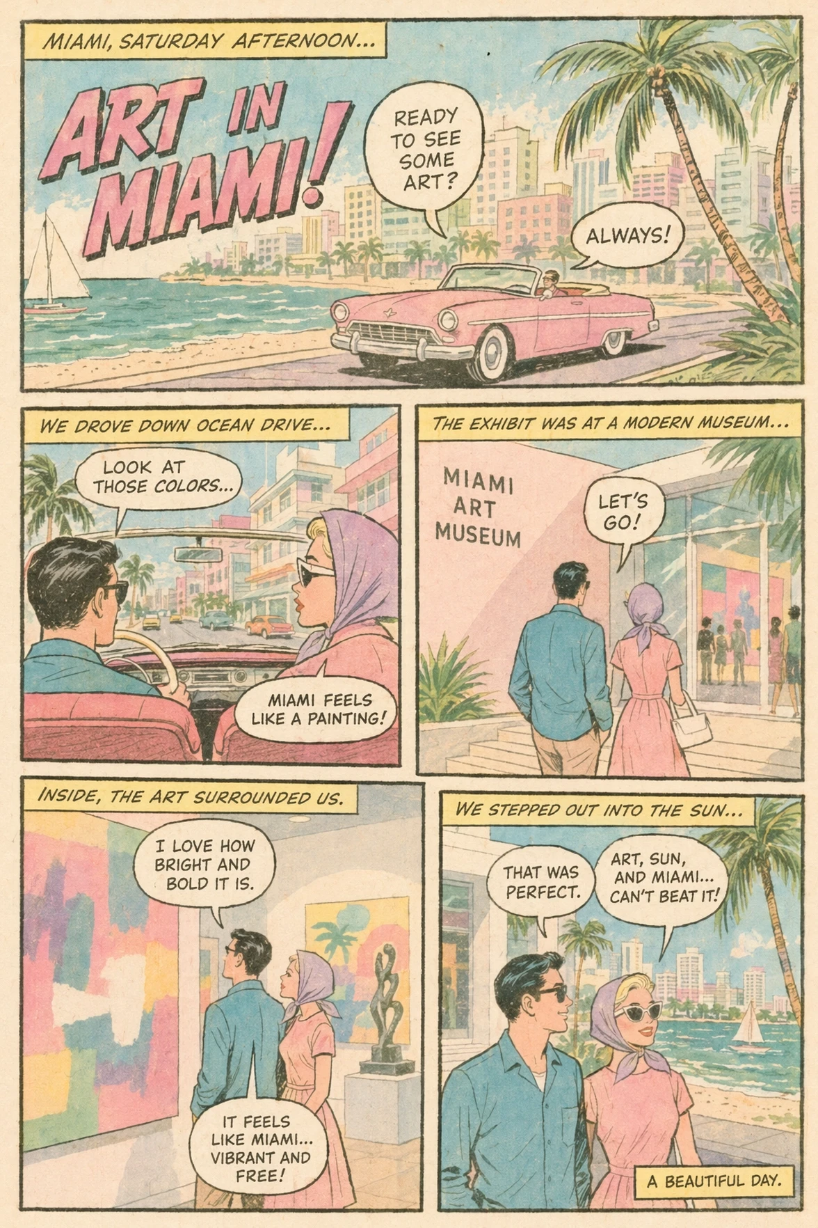
GPT Image 2 프롬프트를 디자이너에게 주는 것과 같은 주의로 작성하세요. 에셋 유형을 먼저 명시하세요: 포스터, 제품 그리드, 만화 페이지, 에디토리얼 스프레드, 인포그래픽, 책 커버, 광고 컨셉, 소셜 이미지 또는 프레젠테이션 비주얼.
의도적인 품질 컨트롤과 더 완성된 디자인 방향을 원할 때 GPT Image 2를 선택하세요. 이 Wenimg 통합은 표준, 중간 및 높은 품질 설정을 제공하여 비용, 속도 및 충실도의 균형을 더 쉽게 맞출 수 있습니다.
프롬프트 전체를 다시 쓰기 전에 아래 항목부터 확인하세요. 한 번에 변수 하나만 바꾸면 GPT Image 2 결과가 좋아지거나 어긋난 이유를 판단하기 쉽습니다.
필수 피사체, 출력 형식, 유지 조건을 프롬프트 앞부분으로 옮기고 충돌하는 스타일 지시는 삭제하세요. 생성할 때마다 요구 사항 하나만 수정하세요.
참조 이미지가 인물, 포즈, 레이아웃, 상품 형태, 스타일 중 무엇을 고정하는지와 GPT Image 2이 바꿔도 되는 부분을 명확히 쓰세요. 선택한 모드가 해당 참조 입력을 지원하는지도 확인하세요.
문구를 줄이고 정확한 텍스트, 읽는 순서, 패널 수, 텍스트 위치를 먼저 지정한 뒤 장식 스타일을 추가하세요.
최종 형식에 맞는 지원 해상도나 품질 옵션을 선택하세요. 저비용 초안에서 구도를 먼저 수정한 다음 더 큰 최종 출력을 요청하는 편이 효율적입니다.
크리에이터 이야기
급한 소셜 콘텐츠부터 클라이언트 초안까지, 서로 다른 작업을 하는 여덟 명의 솔직한 사용 기록입니다.
“GPT Image 2는 속도뿐만 아니라 폴리쉬가 필요할 때 캠페인 비주얼에 가장 깔끔한 경로를 제공합니다.”
 Isabella Reed브랜드 마케팅 디렉터
“품질 컨트롤이 차이를 만듭니다. 거칠게 시작하고 컨셉이 가치 있을 때만 마감을 높일 수 있습니다.”
 Ryan Hu프로덕트 디자이너
“팀이 이 생성기가 가장 잘하는 것을 명확히 설명하려고 할 때 내부적으로 보내는 모델 페이지입니다.”
 Nadia Brooks크리에이티브 운영 매니저
“GPT Image 2는 프롬프트에 뉘앙스가 필요하고 최종 이미지가 캠페인 레디처럼 느껴져야 할 때 우리의 선택입니다.”
 Victor Lane캠페인 아트 디렉터
“품질 수준은 탐색 중 비용을 제어하고 방향이 다듬을 가치가 있을 때만 더 많이 사용하는 데 도움이 됩니다.”
 Mei Tan프로덕트 마케팅 리드
“예시는 더 강력한 첫 번째 결과를 위해 충분한 디테일로 제품 장면과 포스터를 브리핑하는 것을 더 쉽게 만듭니다.”
 Amelia Ford에디토리얼 디자이너
“모델 설명, 컨트롤 및 프롬프트 패턴을 함께 두면 많은 왕복 작업이 절약됩니다.”
 Samir Khan크리에이티브 테크놀로지스트
“클라이언트 덱의 경우 GPT Image 2는 디자인 팀이 최종 프로덕션에 투자하기 전에 더 완성된 모양을 제공합니다.”
 Julia Stone에이전시 계정 리드
목표가 일반적인 프롬프트 실험이 아닌 세련된 OpenAI 이미지 생성일 때 이 카테고리를 사용하세요.
프롬프트 전체를 다시 쓰기 전에 아래 항목부터 확인하세요. 한 번에 변수 하나만 바꾸면 GPT Image 2 결과가 좋아지거나 어긋난 이유를 판단하기 쉽습니다.
✦ 하나의 작업 공간에서 이미지 모델 탐색하기
프롬프트, 참조, 품질 제어 및 예제를 사용하여 제품 샷, 포스터, 광고 및 브랜드 비주얼을 위한 정교한 이미지를 GPT Image 2로 만드세요.
시작하기: GPT Image 2